In the Neapolitan dialect the verb “to love” doesn’t exist. But “l’ammore” (THE love) exists.
This is how Gnut commented the release of his song “L’Ammore ‘o vero” a few years back.
When I heard this song for the first time I remember I gasped.
I remember I was also very moved. The words to this song – to me – transcend the Neapolitan dialect, that in this case is no longer just a dialect, but a way of feeling, which helps us express what would otherwise be difficult to explain in words.
Because words aren’t everything: you don’t get anywhere without a pinch of poetry.
“…Dear Gnut, would you like to put your wonderful words under my press?”.
I didn’t have the time to propose the idea that my drawers had already opened on their own and the printer was eager to do its first tests. “Let’s do it!”
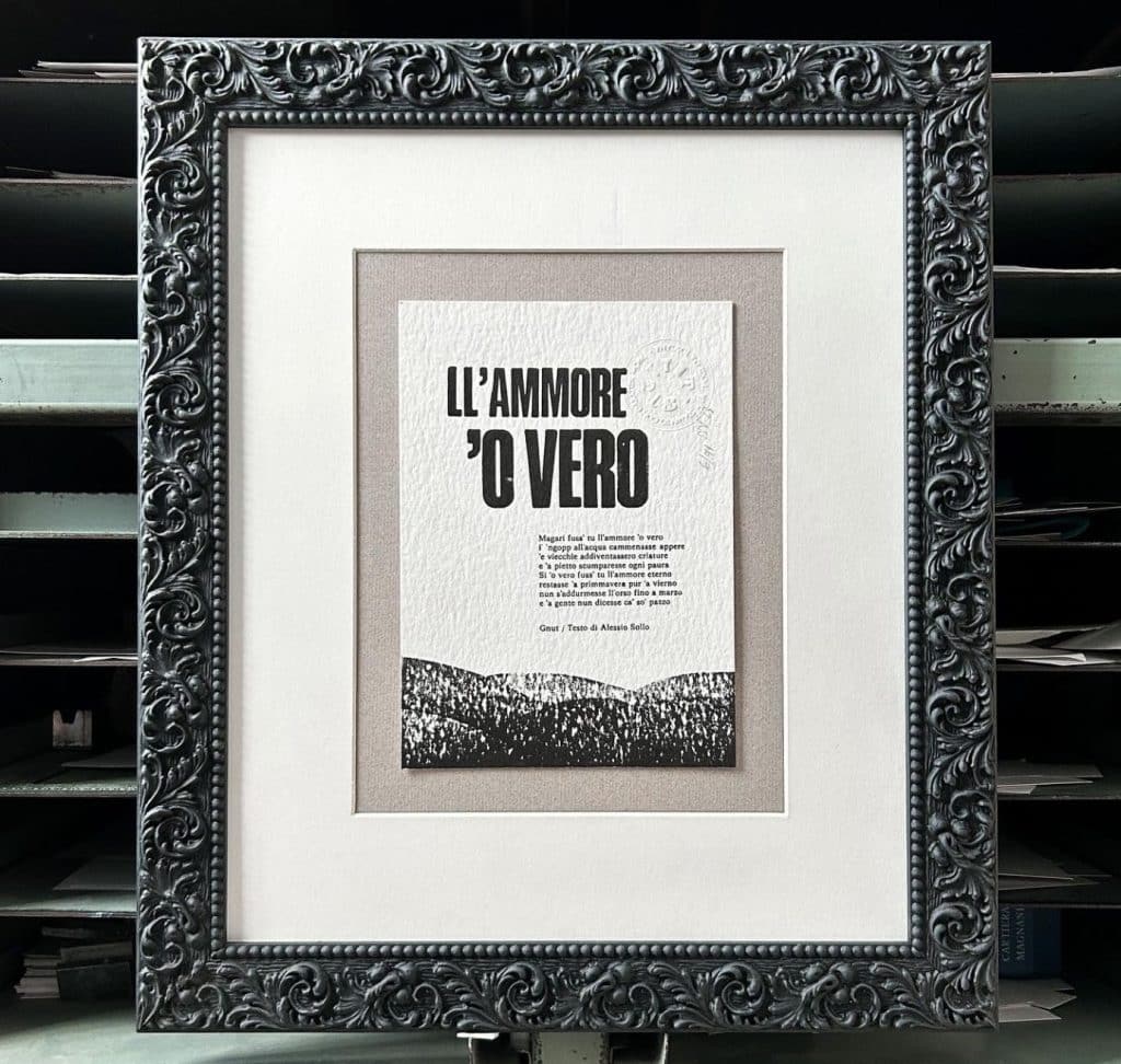
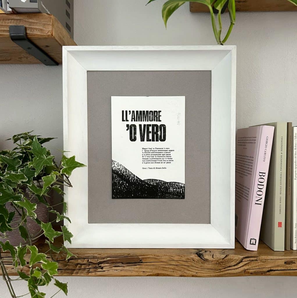
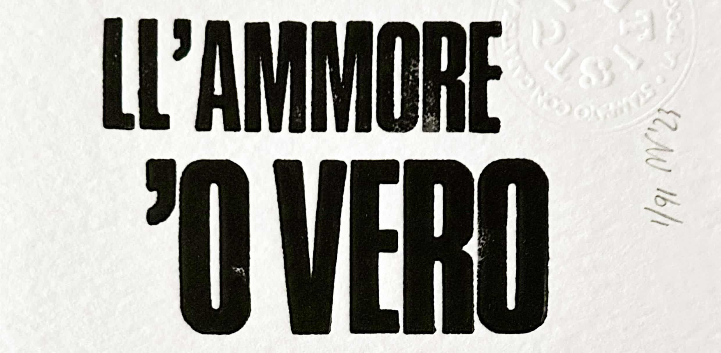
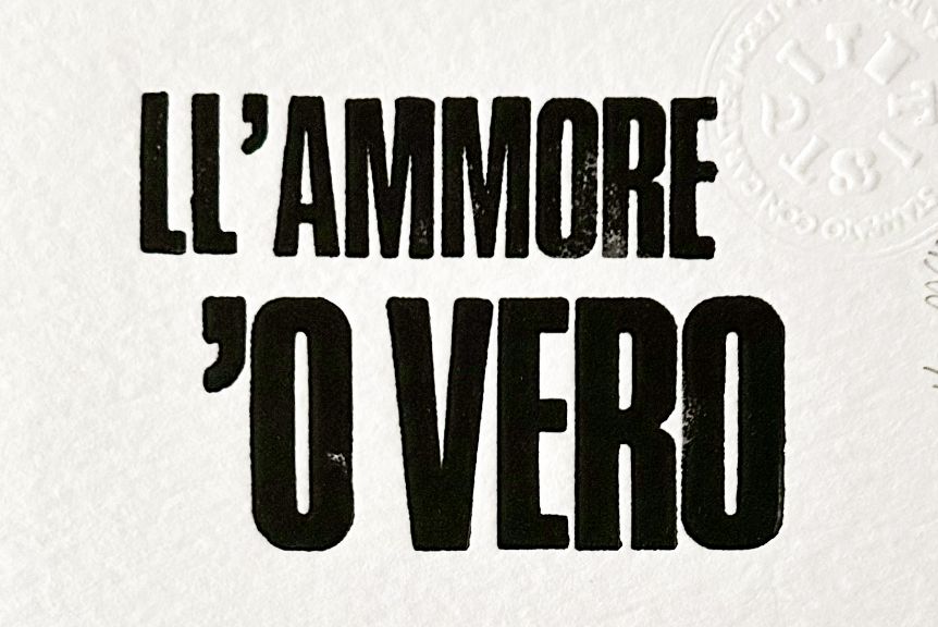
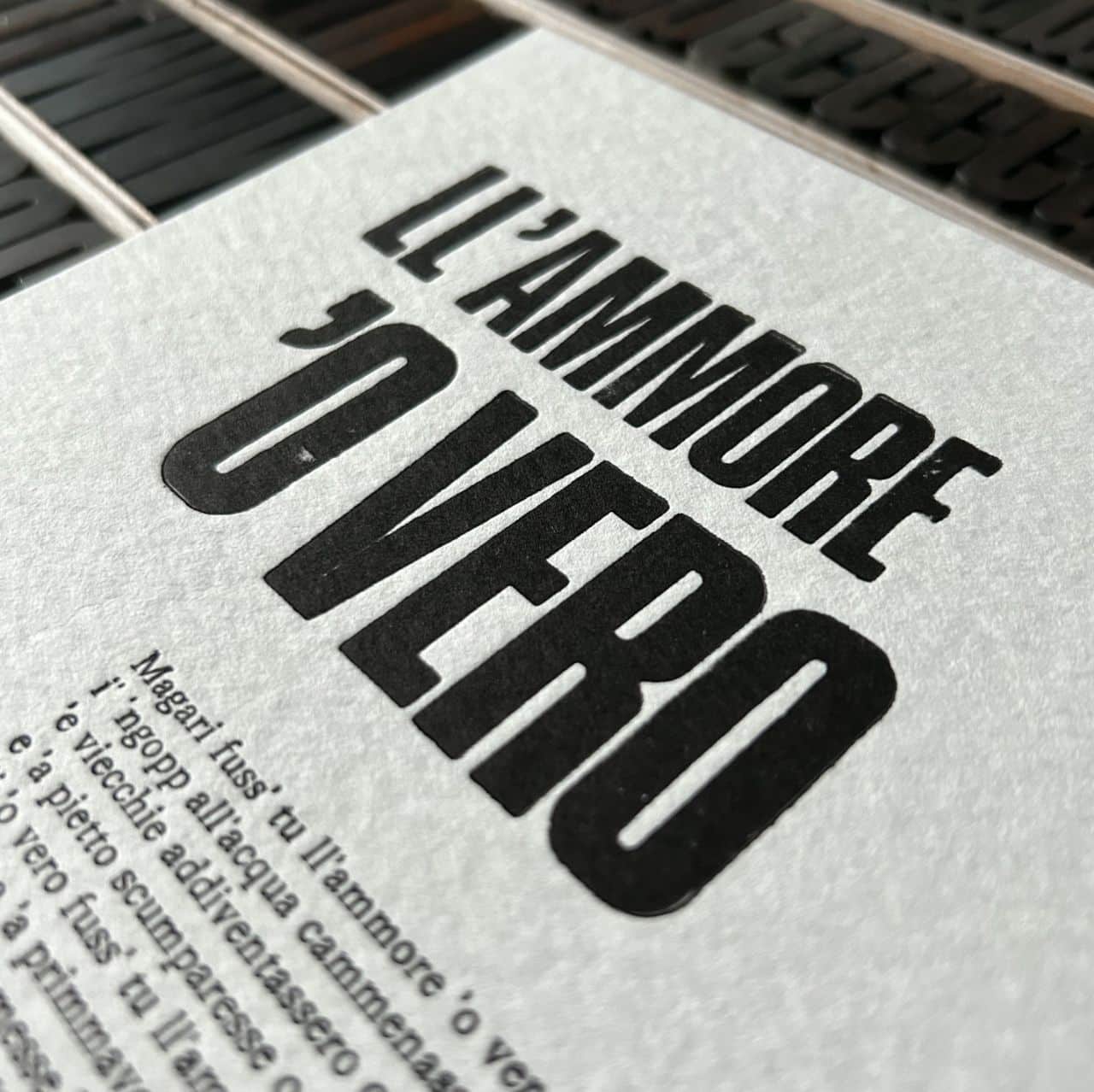
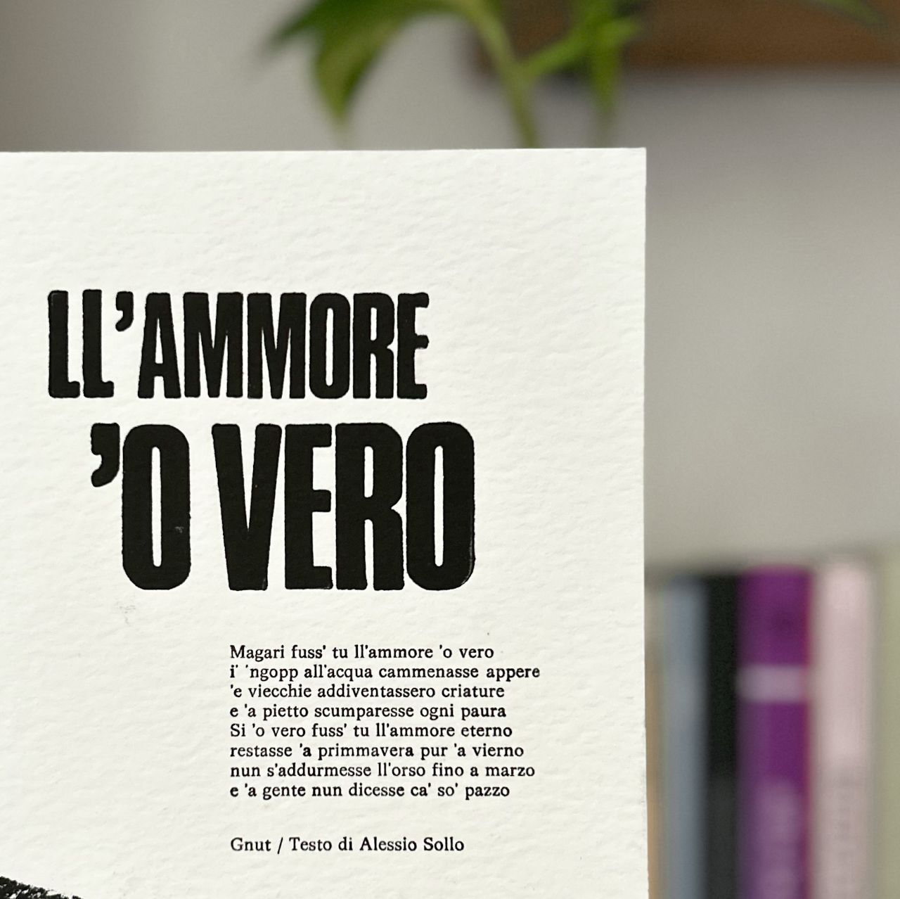
LL’AMORE ‘O VERO
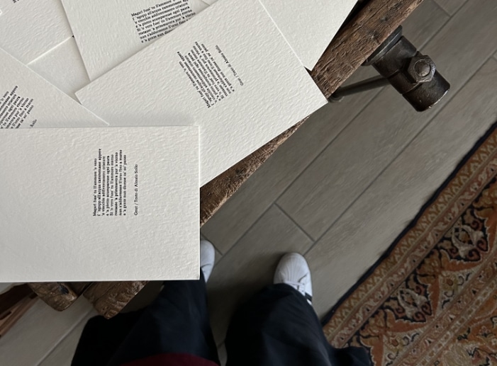
“Magari fuss’ tu ll’ammore ‘o vero
i’ ‘ngopp all’acqua cammenasse appere ‘e viecchie addiventassero criature
‘a pietto scumparesse tutte teme
Si ‘o vero fuss’ tu ll’ammore eterno restasse ‘a primmavera pur ‘a vierno nun s’addurmesse ll’orso fino a marzo e ‘a gente nun dicesse ca’ so’ pazzo”
As a typographer, when I can’t visualize a concept I like to print it, to free myself from the burden of having to find a form for it, a name, a definition.
But how does one go about printing “LOVE”?
In his songs you get lost among musical influences from around the world: starting from the English folk of Nick Drake and John Martin, by way of Neapolitan music, then through blues and the African music of Mali.
“L’ammore ‘o vero” is his entry in Daniele Sepe’s album “Capitan Capitone e i fratelli della costa”, originally based on a text by Alessio Sollo.
Just like my other collaborations with authors and poets, this print has also been greenly by the author.
And just like in my other collaborations,
words once again find a new dimension
under my press: side by side. Like in poems.
Aaaaah, there it is: true love!
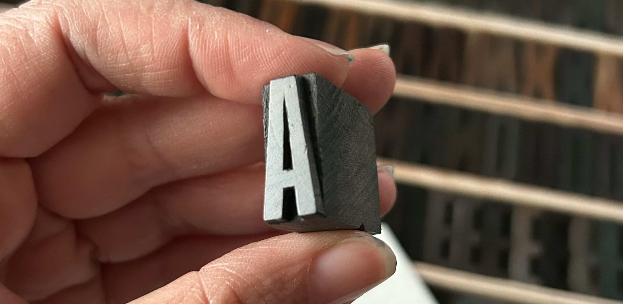
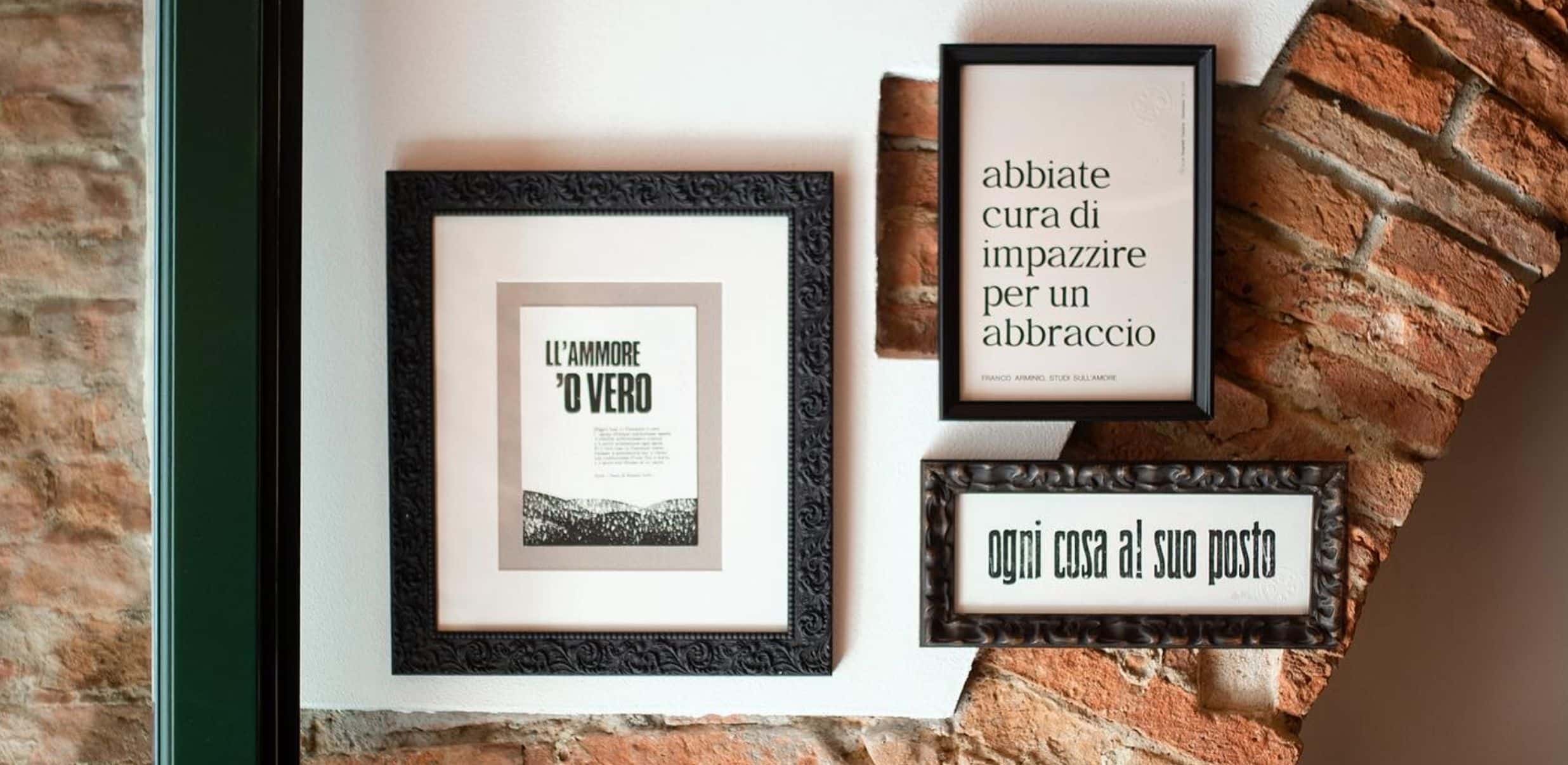
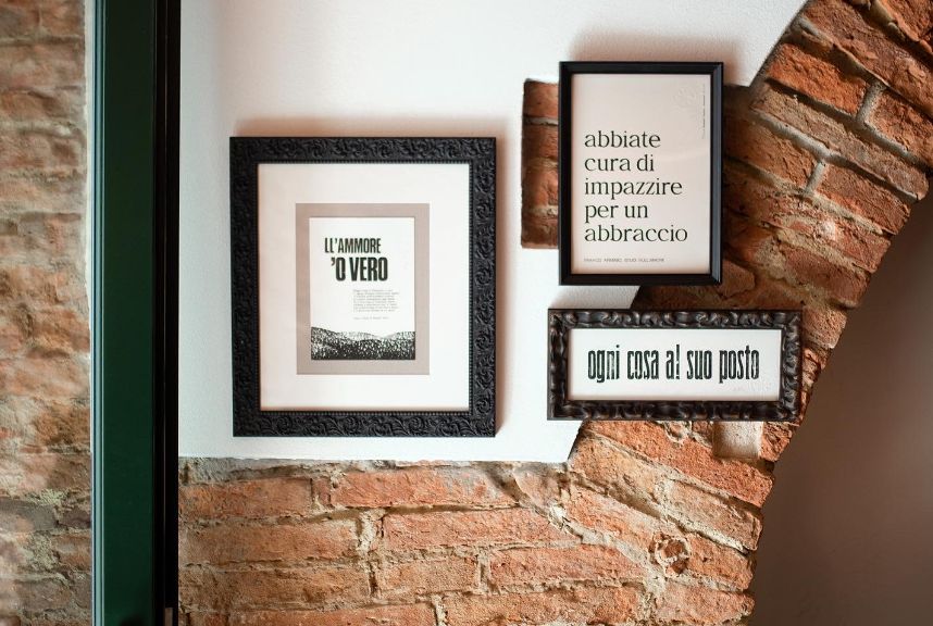
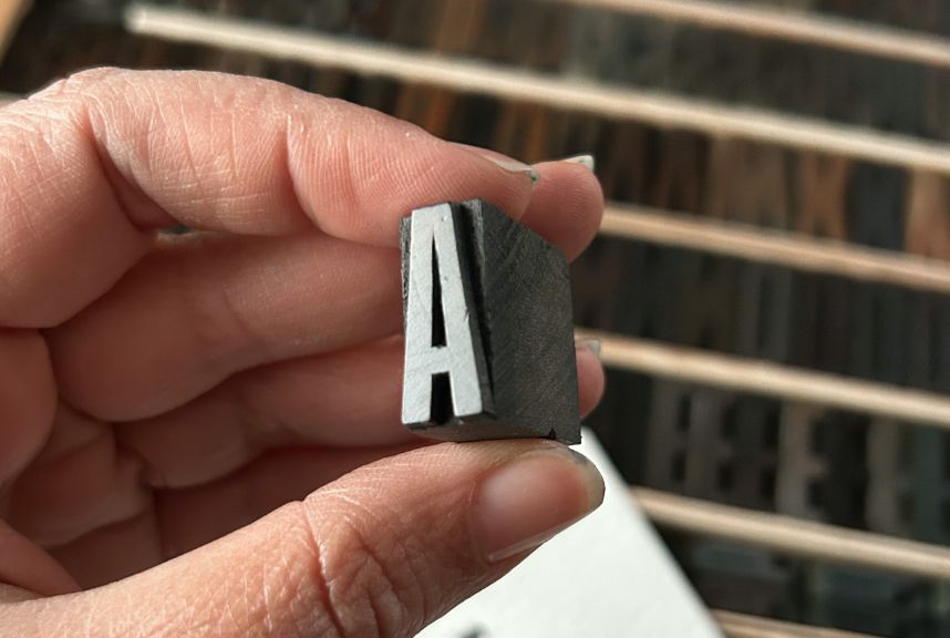
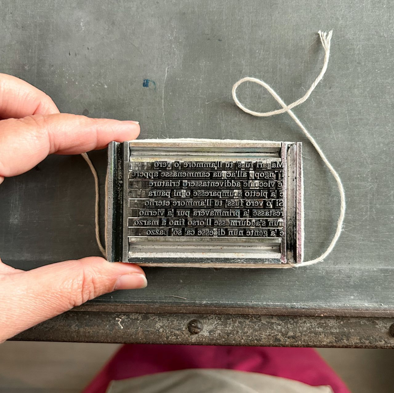
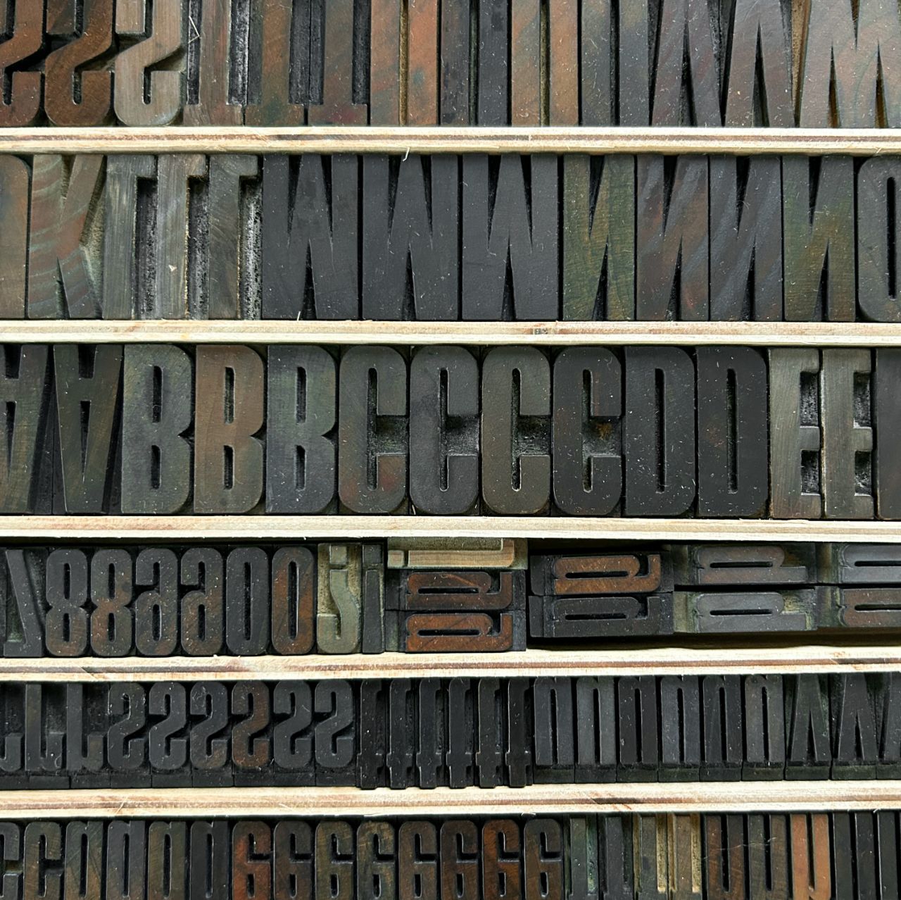
The print was created with three steps. The lead typeface (Magister, 1966 – from San Casciano Val di Pesa) went through the rollers of the small Hohner machine.
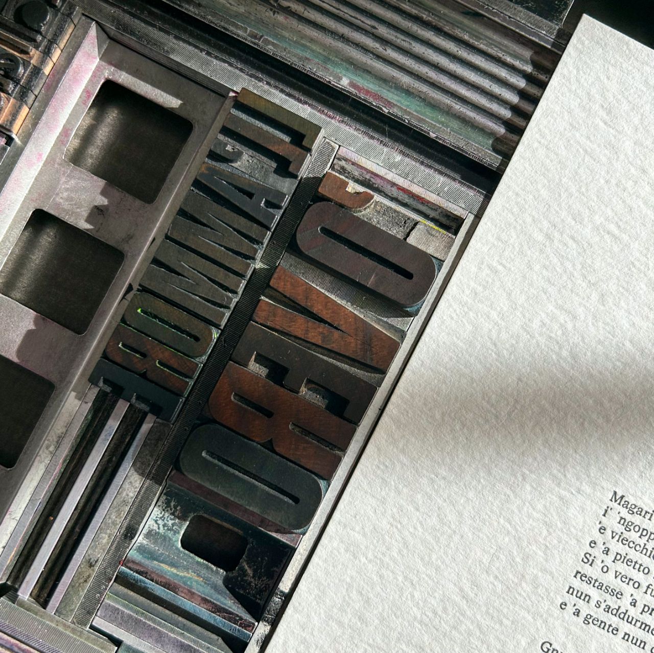
The wooden title (early twentieth century, from Catania) felt ALL OF the pressure of the proofreader: I wanted the words to become almost three-dimensional to the touch, so that love could truly be felt and touched.
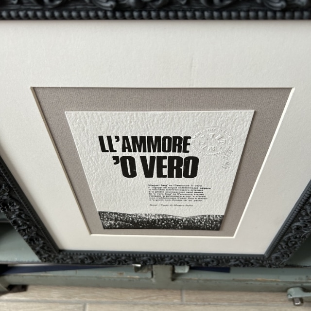
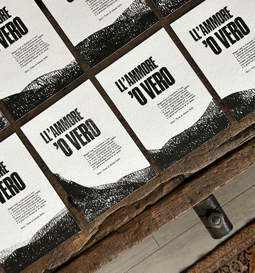
Available on my shop. Format 15×21 cm. The paper is a beautiful Cordenons Wild 450 gr (with 35% cotton… a real pleasure to the touch).
Here it is: love.
