


It’s may 2020. The alarm goes off at 5 in the morning. I put a face-mask on and I’m off to Levanto. To take a plunge into the splendid Ligurian Sea? Nope, rather a hasty rush to save what remains of an old printing workshop before everything ends up in a landfill. What remains is what interests me. What remains is, often, what in one way or another is destined to remain for a little longer.
Salvaging typography in levanto
This time I’m not headed to a printing studio that is closing, but a typographic house that is moving to another location. All modern equipment has already been transferred to the new location and what remains here is everything that is old, that is no longer able to keep up with the times. And these modern times are usually characterized by a mere policy of price, speed and supply.
Today those who print, must run.
What happens when a typographic studio closes or moves? It goes pretty much like this: you call a company specialised in disposal and you pay to have everything that is no longer of use thrown away. But how the hell do you pay someone to throw away a piece of history of typography? I have asked myself this question many times and have also given myself many answers. I believe that above all else, it is a matter of lack of vision .
I am a woman who deals with movable type printing and I’m sure you can imagine the look of my male colleagues’s faces when I show up at their door. Usually they make fun of me and if I tell them about my project they tend to laugh straight at my face. And a question always follows… “ but can you live off this stuff?”. They, who pay people to have their history dismantled, ask me if I can live off typography.
This is the afore-mentioned lack of vision I was talking about.
What remains of a printing workshop after dismantling?
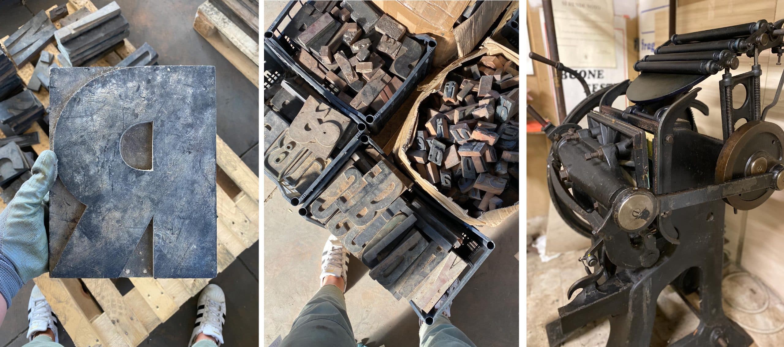
Let’s get back to my story in Levanto. I didn’t have time to save the characters in lead, all the drawers had already been thrown into the bins (they are to be sold to foundries to be remade into bullets for hunting and WOW, how miserable).
However, many chests of drawers, tools, old printing machines remain. And above all: wooden typefaces. An avalanche of wooden typefaces remains .
I have always been fascinated by labels glued on drawers. Sometimes they make me laugh; other times I try to read them in sequence to form a sentence. They weren’t put there for decoration though, they told the printer what typeface was stored in that exact drawer. A visual reminder, to find typefaces more easily (I’m doing the same in my Atelier, and at some point I will tell you about this mad endeavor of mine).
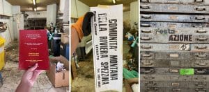
I also found a fairly recent book on the floor which intrigued me: “Words of the dialect of Monterosso al Mare”. And then, glued to the wall, a print pops up, telling me a little piece of the history of these places (mountain community of the Riviera of La Spezia). Machines and typefaces are essential to bring forth the job of typographic printing, obviously, but I also need to bring a bit of the soul of these places with me. This is the kind of typographer way I want to be: absorbed in the craft of these small and seemingly insignificant details.
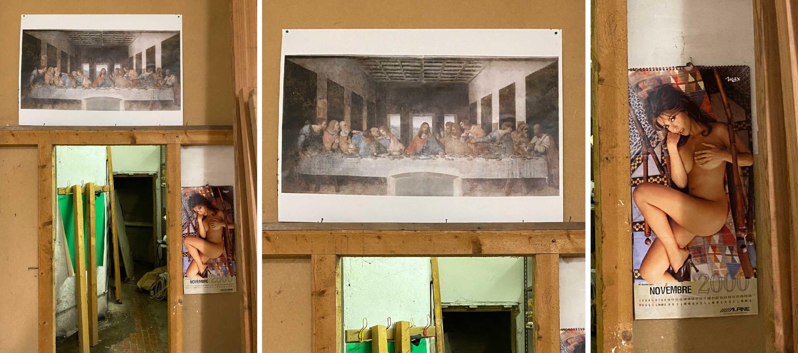
Sacred and profane on the same wall of this printing workshop. Leonardo’s Last Supper and Max’s calendar. I love it.
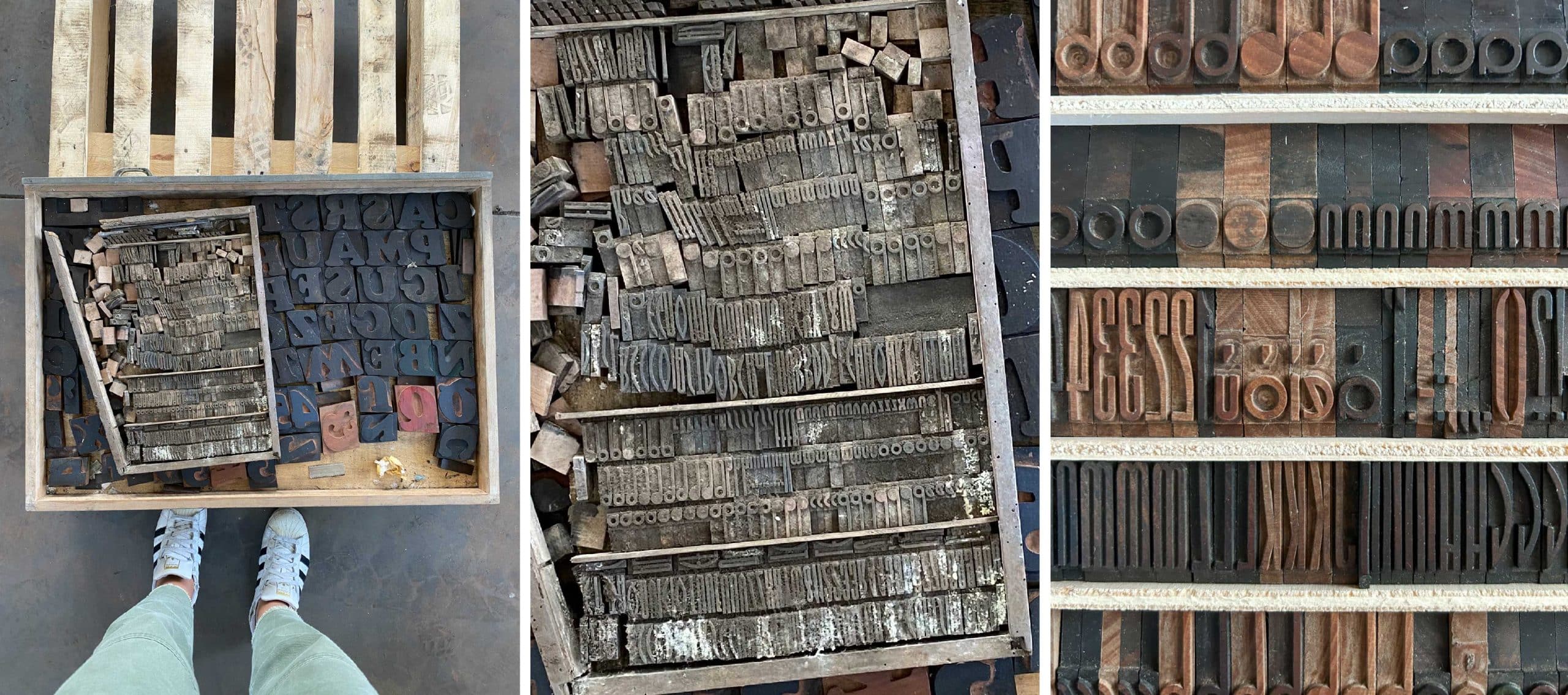
Some of the alphabets left were still in their drawers. Others, however, had been thrown into cardboard boxes, resulting in a fascinating-looking mixture of things that required days and days of work to recompose and put together again, letter by letter.
Egyptians, sans serifs, fantasy typefaces and everything in between comes out. Everything is lathered in dust and dirt. Some large typefaces had been nailed to a wooden board to make a stool … (OOOFT, Lord give me strength)!
They have all been saved and all have been cleaned, tidied up and archived (I think I still have a few boxes to clean, even though it’s been three years, but cleaning and tidying up takes a long time).
Check out this before/after. Incredible right?
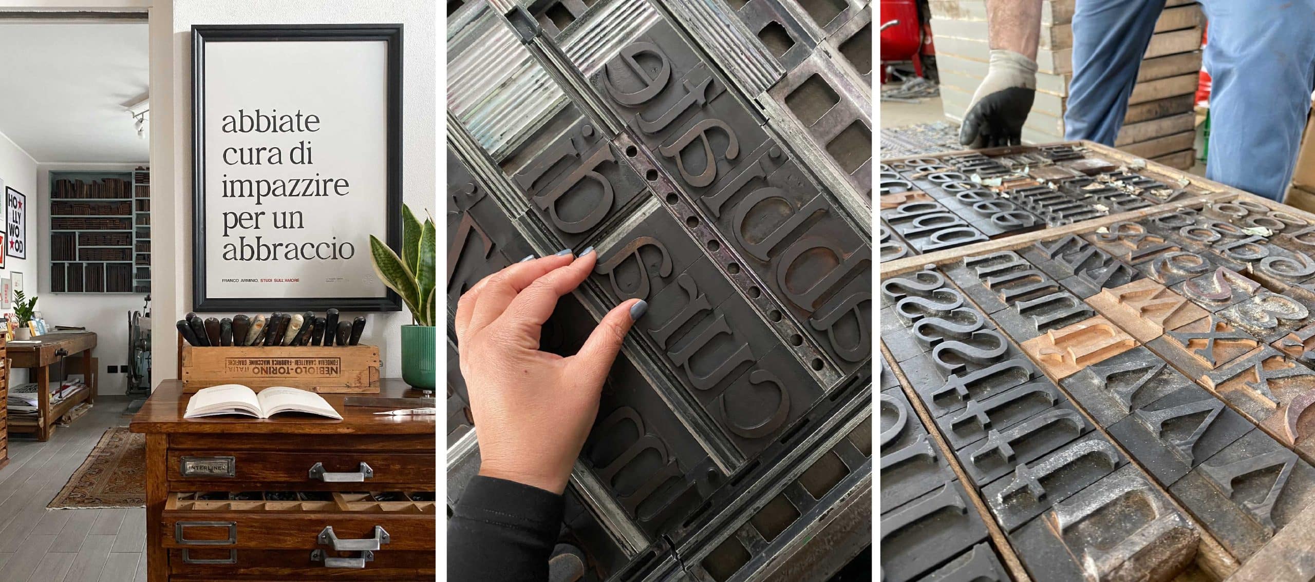
The serif character used for “studies on love, take care to go crazy for a hug” – the poster that celebrates the famous poem by Franco Arminio – comes from here. Did you recognize it?
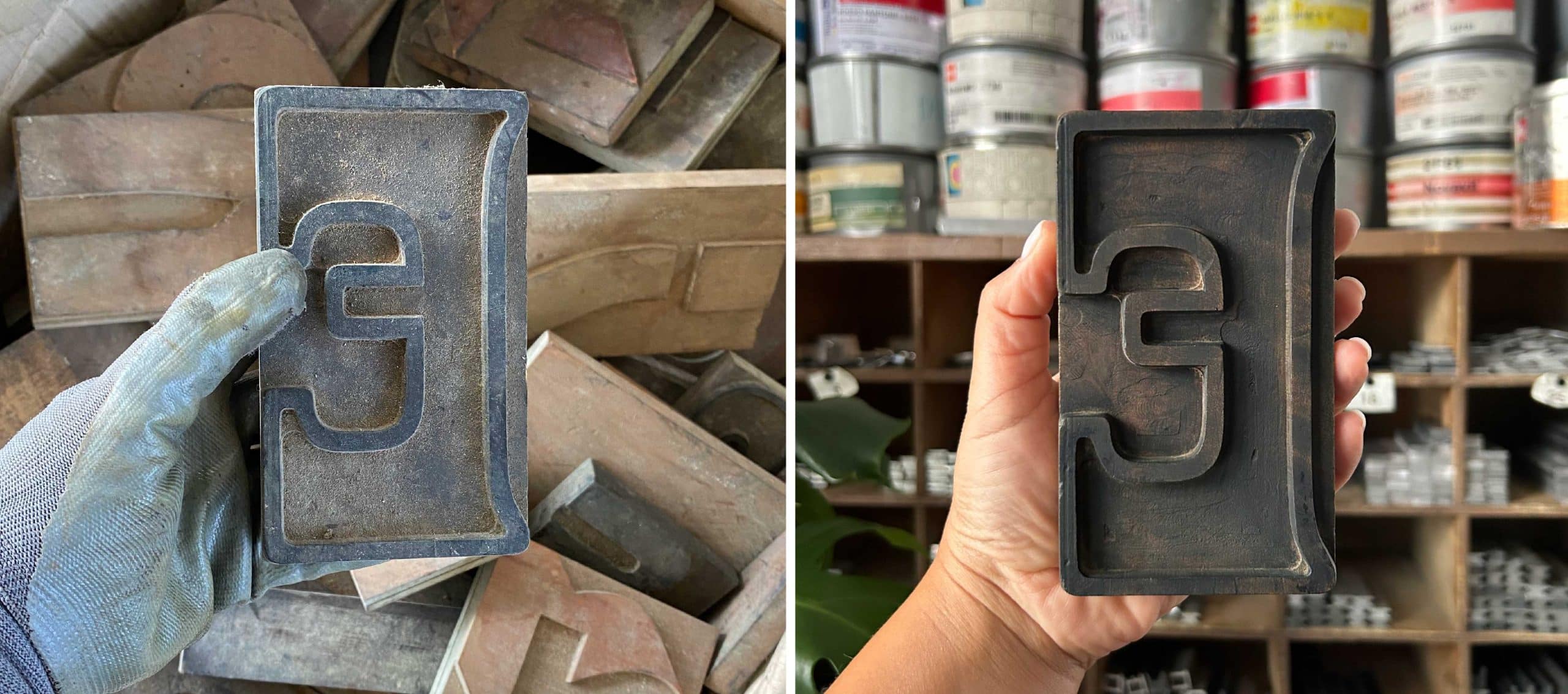
Then suddenly she pops out, a small box, completely destroyed. I barely get to open it and its rotten wood crumbles right off my hands. However, the alphabet of typefaces it contains is still intact. It is called “Imperatrice” and was produced by Xilografia di Verona. Here’s some of the peculiarities of this set: some letters have variants, some are full and others empty (a, o, p, q, b, d…)
Furthermore, ascenders and descenders are very long, like the letters p,q ,d,b … (in typography ascenders and descenders are the parts of the letter that extend above or below the baseline. They help improve the clarity and readability of the text and are important for maintaining visual harmony between letters) .
Look at the before/after. A salvaging job that took a long time, considering that this wooden series is very very small.
I have many more typographical adventures to tell you. I won’t do it chronologically; Between one printing workshop and another , a lot has happened in five years. However I just couldn’t have the first article of this blog to at least smell of the sea.
Otherwise, how could we call it a plunge into the past ?
Si stampi chi può!