Terzilia Toscani – my grandmother, class of 1914 – always wondered what did I do for a living. “I’m a Graphic designer, Grandma”. She would raise her head from the Sesto Caio Baccelli (the lunar calendar, always present in the Vincenti family house, the necessary map to figure out the best sowing days in the fields) and with a perplexed look she would ask: “…Uh?”.
This was usually followed by my scrambled explanations, such as “I design adverts”. She would smile, lick her index finger and continued to scroll through the pages of her book. Dear grandmother, today
I would tell you that I am a typographer and that
I am about to “enter” a magnificent place, called “Tipoteca Italiana”.
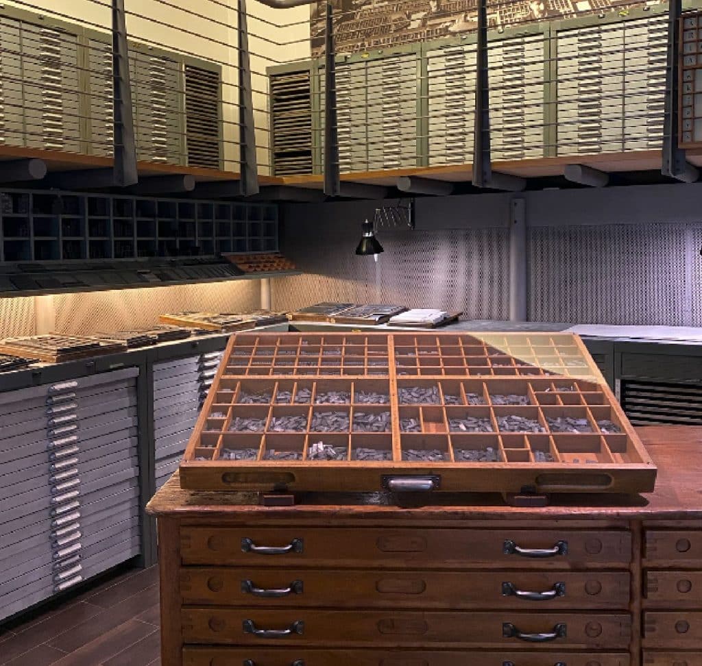
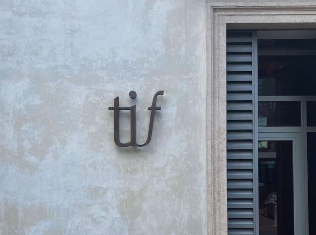
But how exactly did I get there? Easy, by having a nice trip into the past.
I searched and found some new drawers to put my old dreams in. When I need them I take them out and live them all, one by one. Indeed, twenty-five by twenty-five.
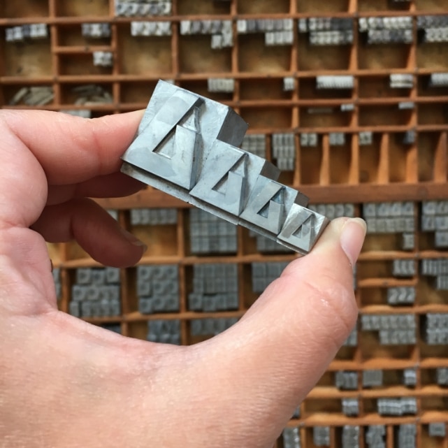
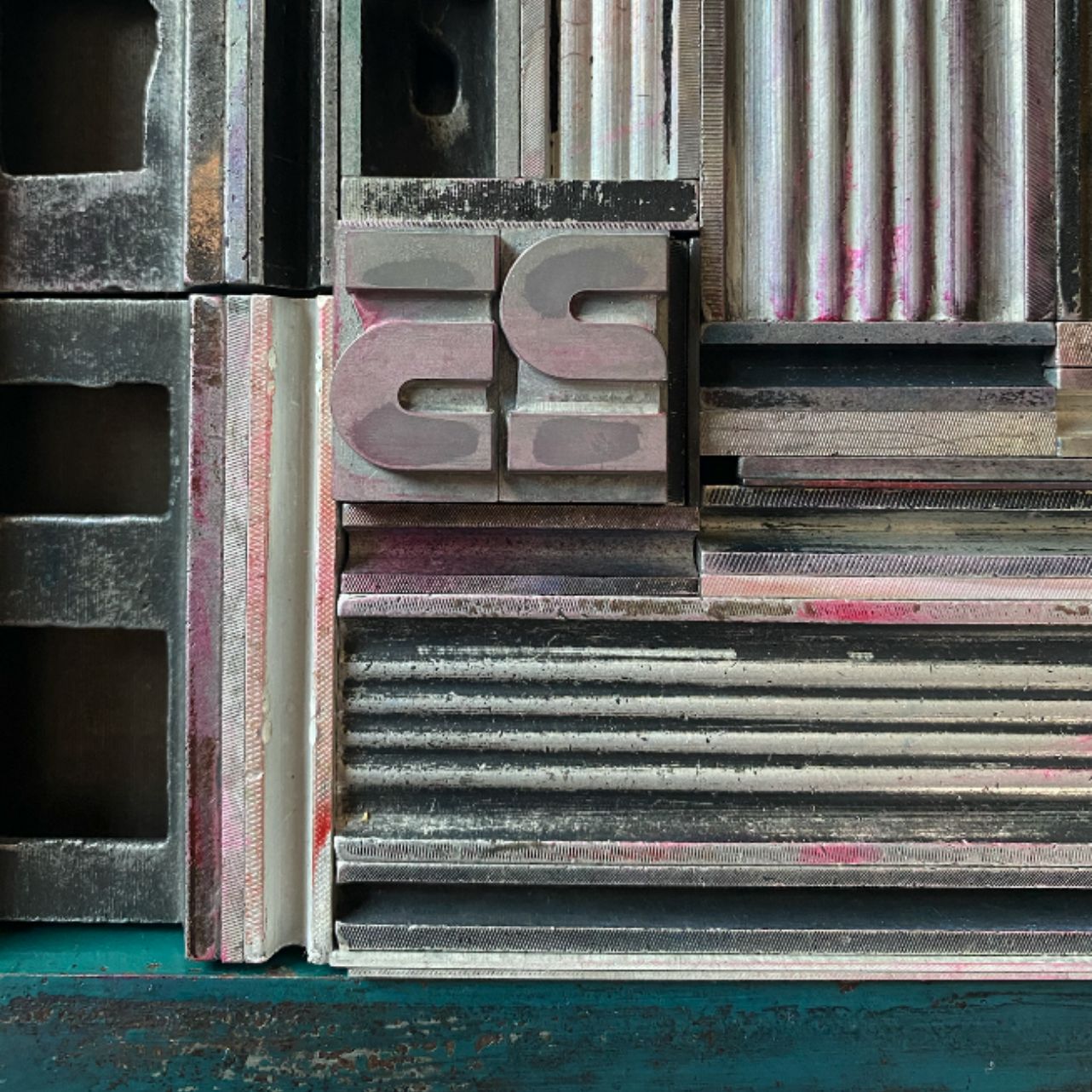
Tipoteca Italiana is a point of reference for typography, even outside national borders: an immense archive of typefaces and printing machines. A collection of significant historical value, yet STILL not completely catalogued in its entirety,
a source of inspiration for scholars and enthusiasts.
WHAT IS TIPOTECA:
First of all, Tipoteca is the stuff of dreams. For all graphic designers, typographers and anyone involved in visual communication, Tipoteca offers a unique interdisciplinary space: museum, archive, library, print shop, gallery and auditorium – all entirely dedicated to the discovery and experimentation of the art of typography.
The dialogue between the past and the present is a central detail of my work: translating 500 years of printing history into the 21st century is a hard job (but someone gotta do it) but Tipoteca helps us all by organizing visits, workshops, temporary exhibitions and meetings.
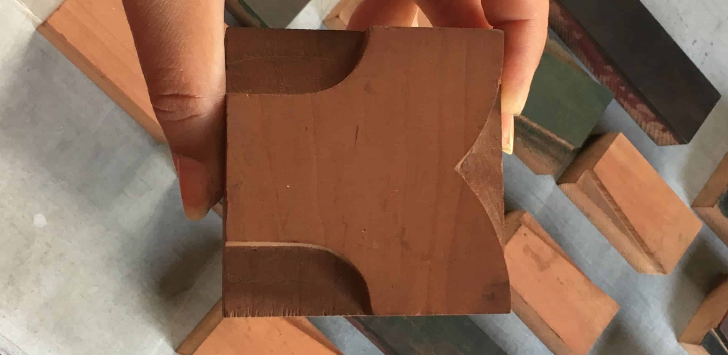
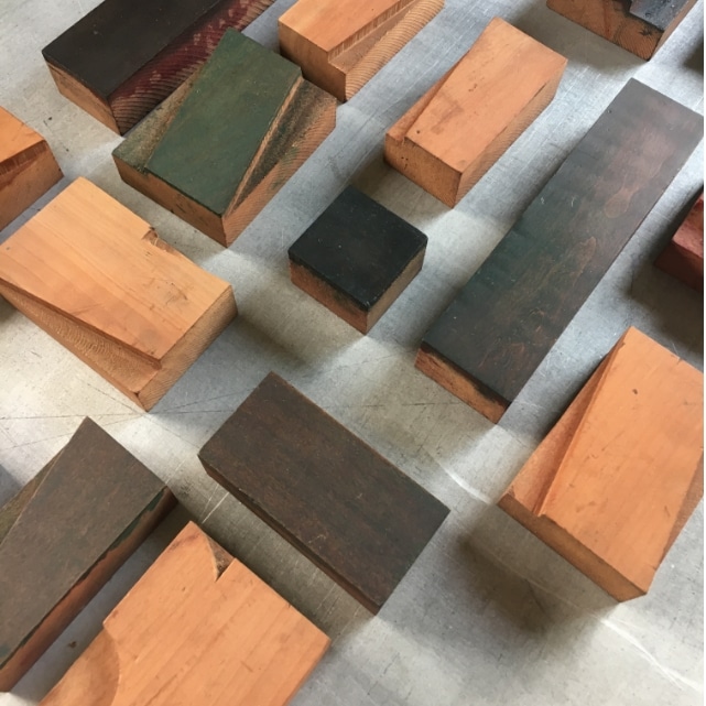
In the spaces of the Foundation one can study presses, machines and printed matter up close, with a space dedicated to the very extensive collection of typefaces and matrices.
A unique space, full of invaluable resources for all those who – like me – lose their mind for the history of communication.
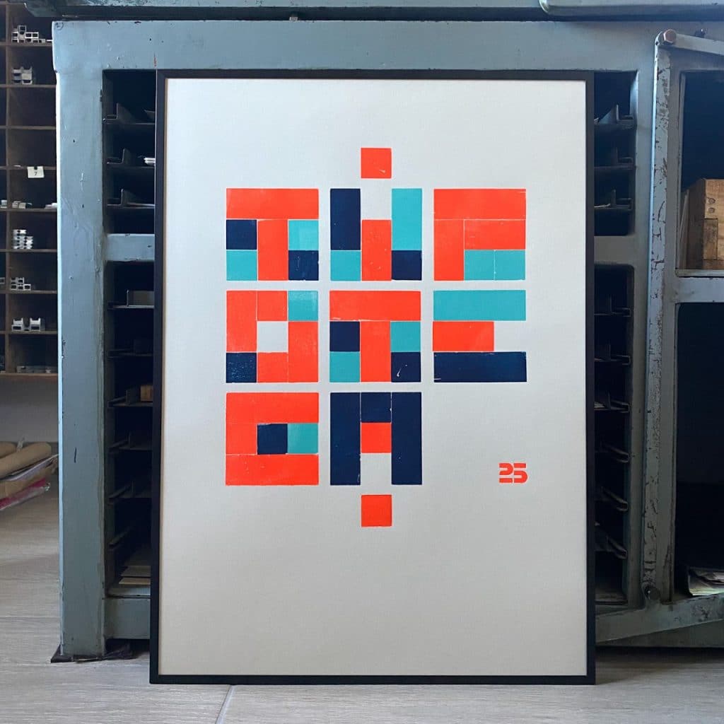
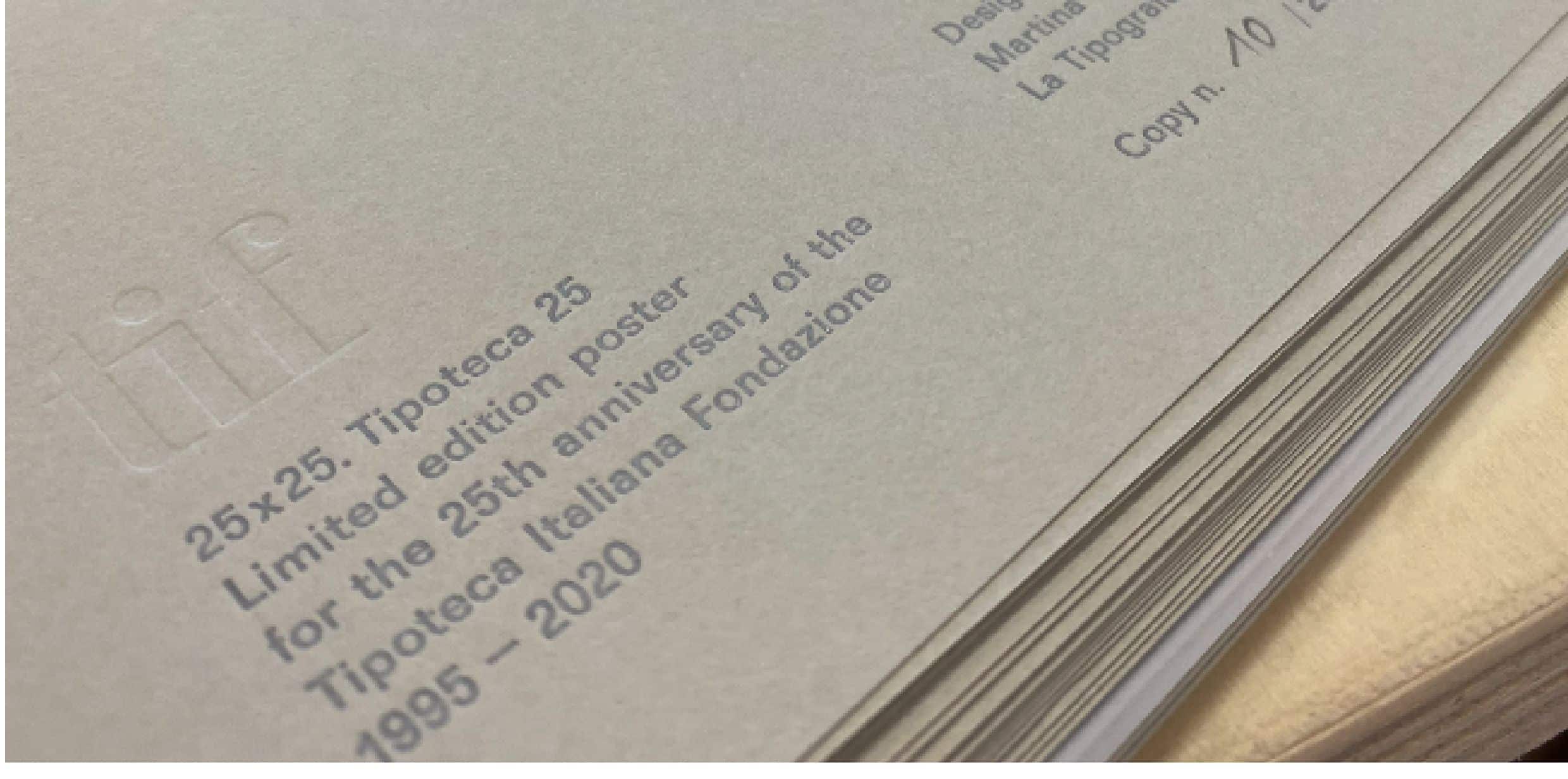
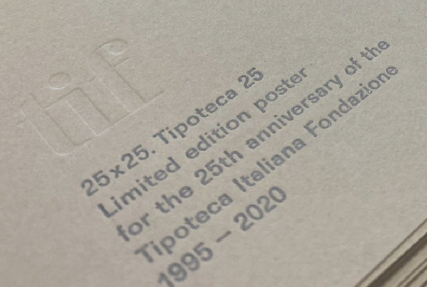
As a “gift”, Tipoteca asked 25 designers and typographers (Italian and foreign) to design a poster for its birthday. Thus the Tipoteca 25×25 project was born .
One of those designers and typographers, is me:
a real,TRUE honour.
And – icing on the cake – the posters were exhibited in exhibition throughout the summer in the Tipoteca Gallery from 21 June to 31 October 2020
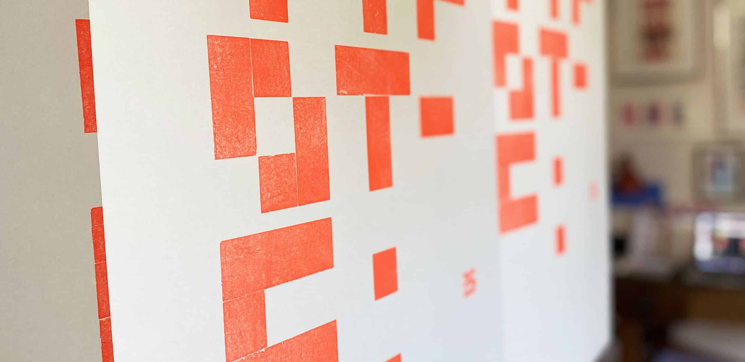
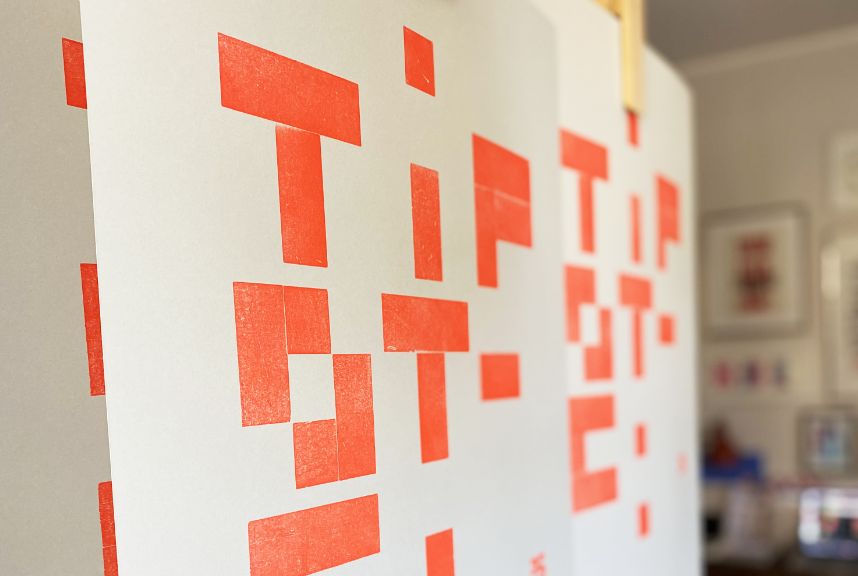
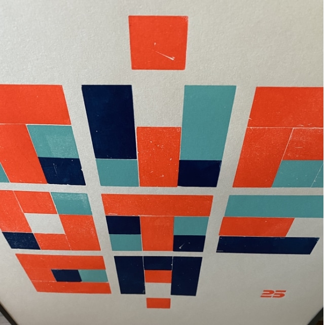
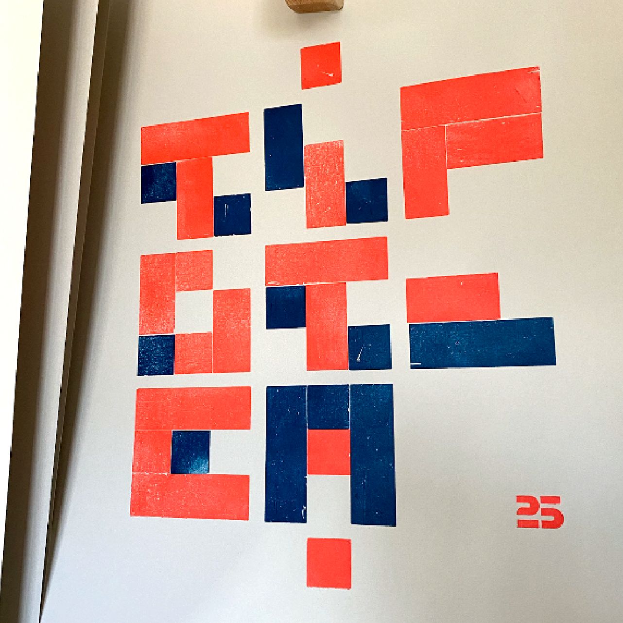
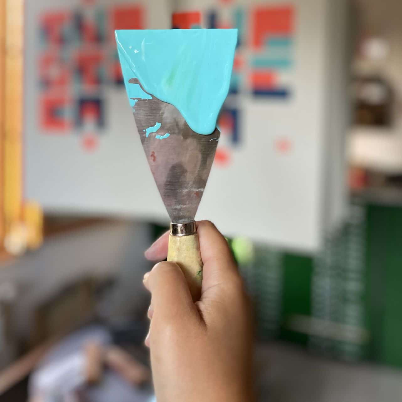
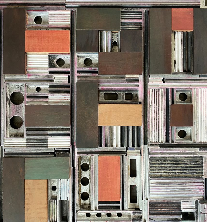
Midnight blue, light blue and fluorescent orange. A different and creative way to interpret the alphabet, inspired by the idea of play, just like a typographical tetris game.
