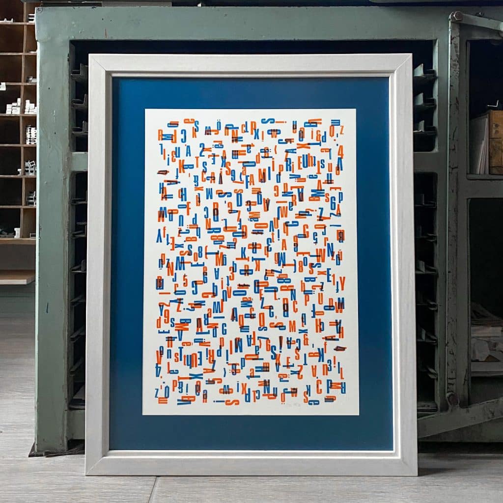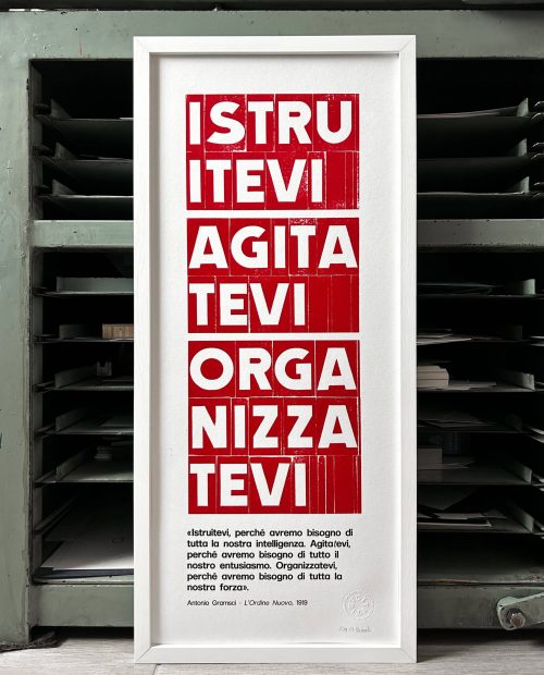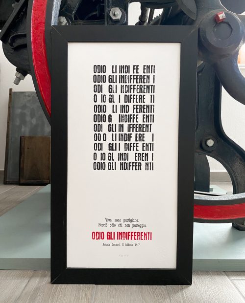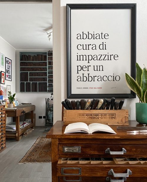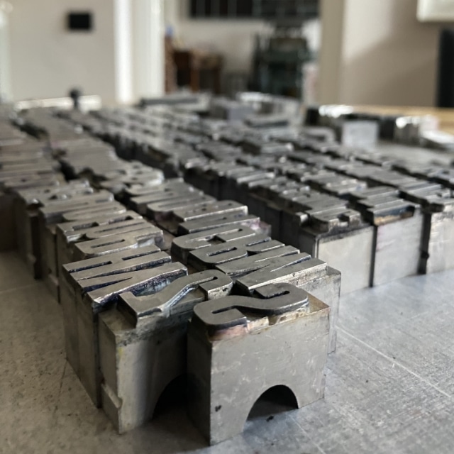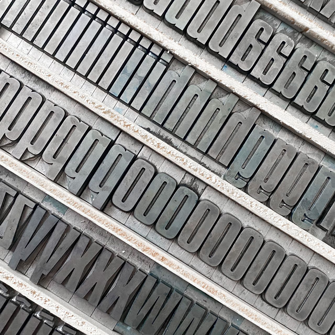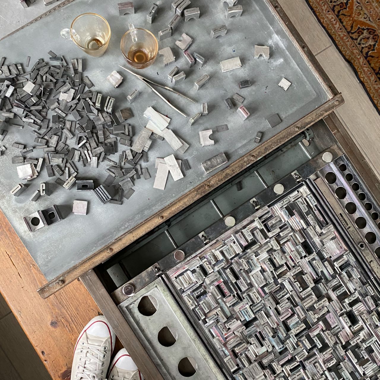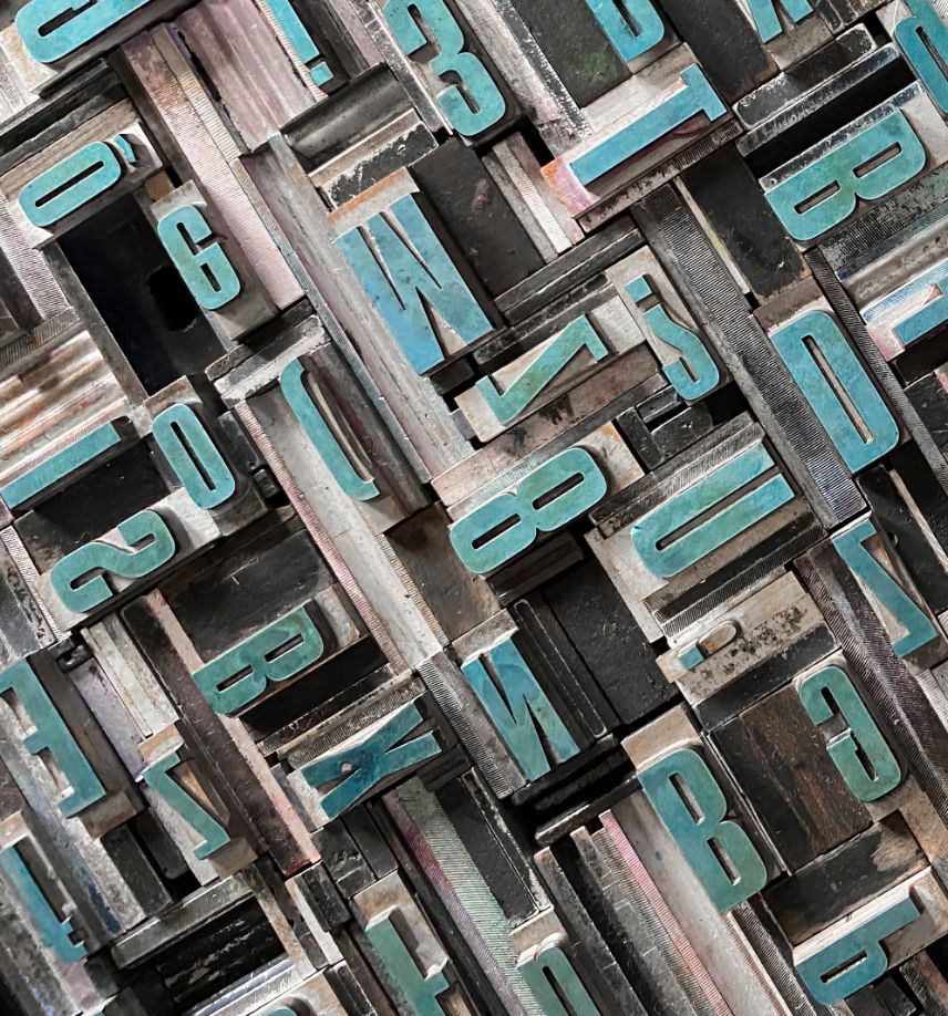
Have you ever wondered who designs the fonts we use every day? What do a dusty drawer full of typefaces, a transfer sheet of types, and a digital font have in common? A metropolis of things.
But first, let’s take a step back…
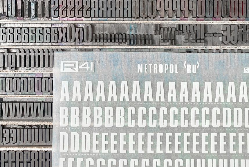
Spresiano, Treviso, 1960. Renato Bernardi, an entrepreneur from Verona, founds Reber. We are talking about one of the major international font transfer companies, for many years on the tables of millions of designers and creatives. The friendship and deep respect between Bernardi and Aldo Novarese (a character designer for the Nebiolo Foundries in Turin) translates into an extraordinary collaboration. Thus starting from 1969 the Nebiolo typefaces, created for lead, entered the world of transfers, key elements of the advertising reality of those years.
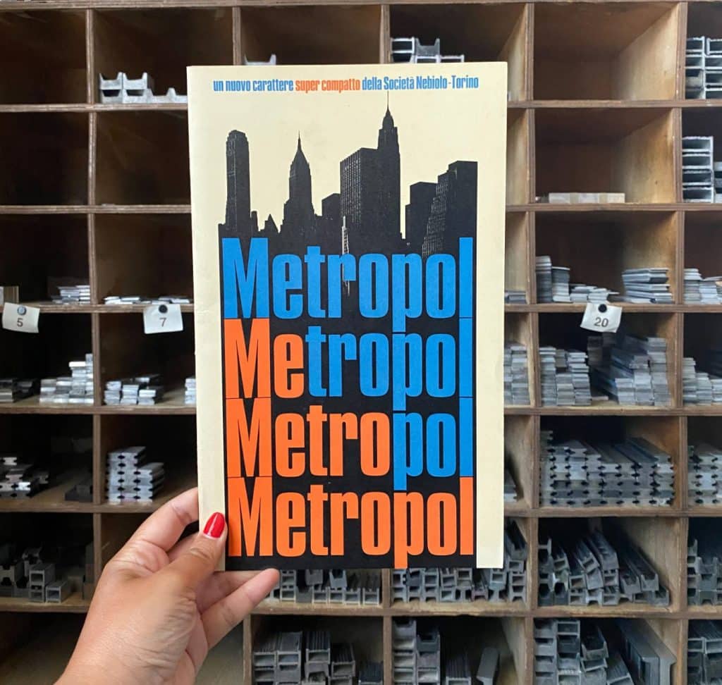
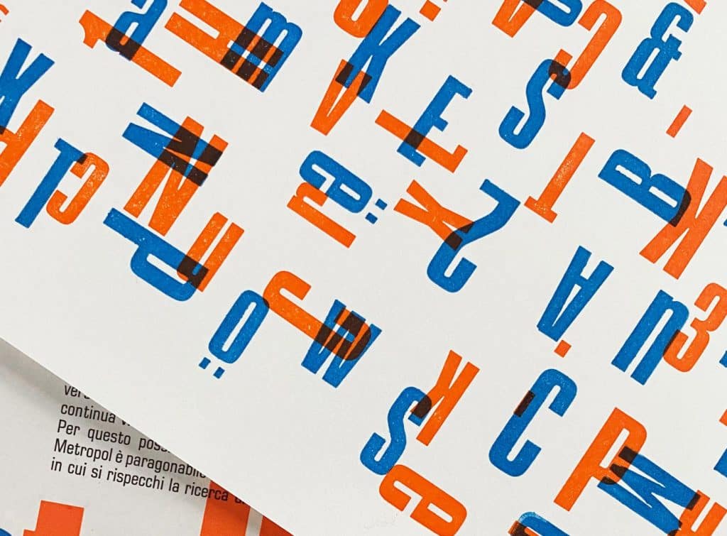
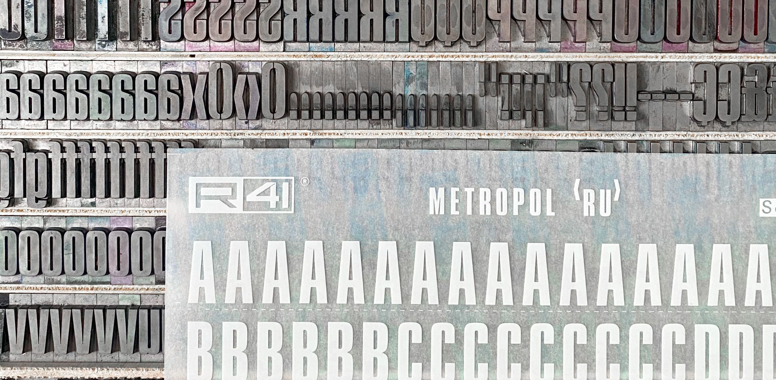
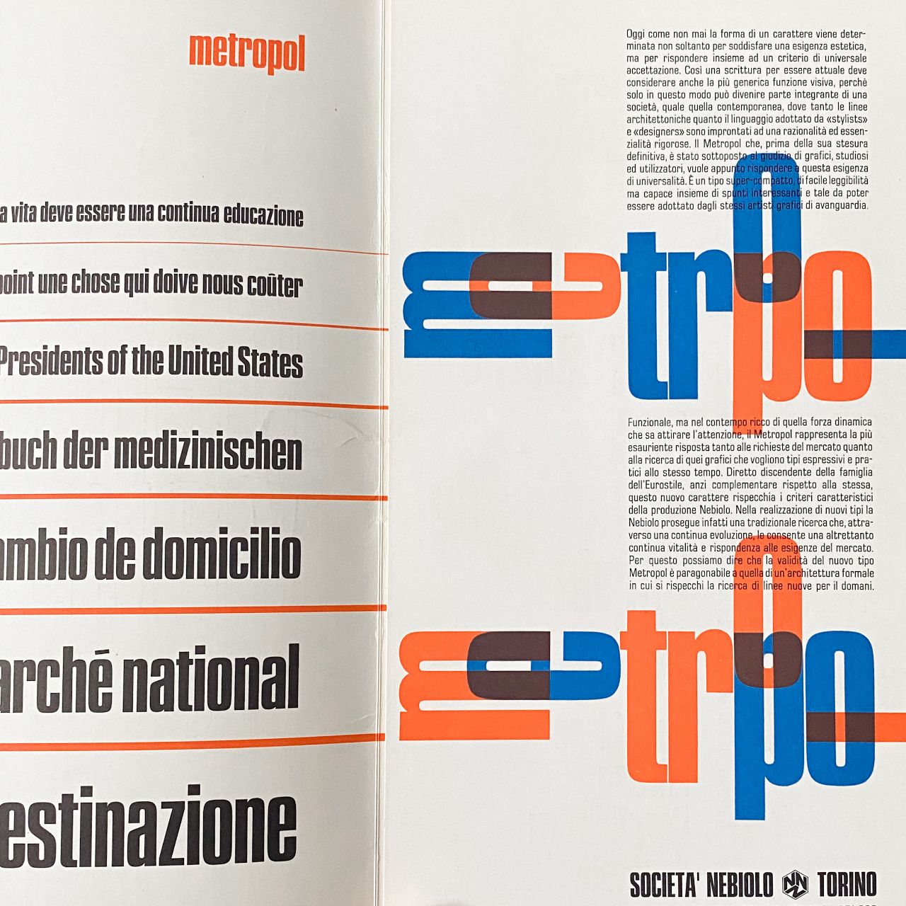
The Metropol typeface was designed by Aldo Novarese for Fonderie Nebiolo in 1967 and it entered the Reber R41 catalogue in 1971.
“Today, more than ever, the shape of a typeface is determined not only to satisfy an aesthetic need, but to respond to a universal criteria of acceptance. Metropol has the voice of the skyscrapers, of the traffic, of the city that never sleeps: a real dive into modernity.”
A dive into modernity… but with an inevitable reference to the origins, the irreplaceable feature of Novarese’s modus operandi. In his presentation, in fact, he describes it by saying that: “Advertising and titles of newspapers and magazines are fascinated by this character,
Along with Caterina from R41 we decided to pay homage to this wonderful typeface. There were months of discussion, ideas, planning. We became passionate about the history of Novarese and dug into his very precious archives and historical documents, starting with the specimen sent to me by R41.
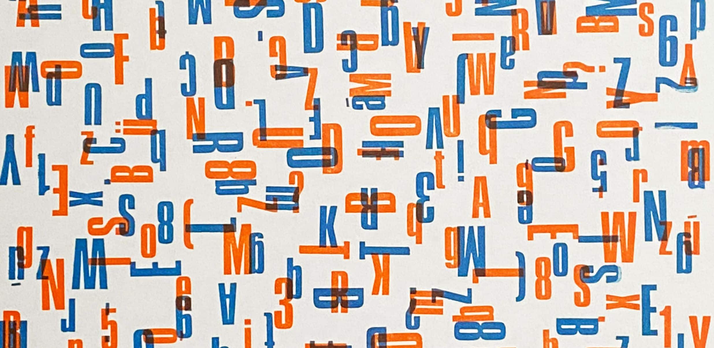
From this beautiful collaboration a poster was born.
To be honest though, for me this is more than a poster, this is the result of intense study, exchange and research. Don’t ask me how many hours of composition it took, because they are truly incalculable. Months of discussion, planning, and laughter shared over incessant calls between Caterina and I. And in the end, behold, the shared the emotion of seeing, for the first time, the result of a very intense project, that is full of history .
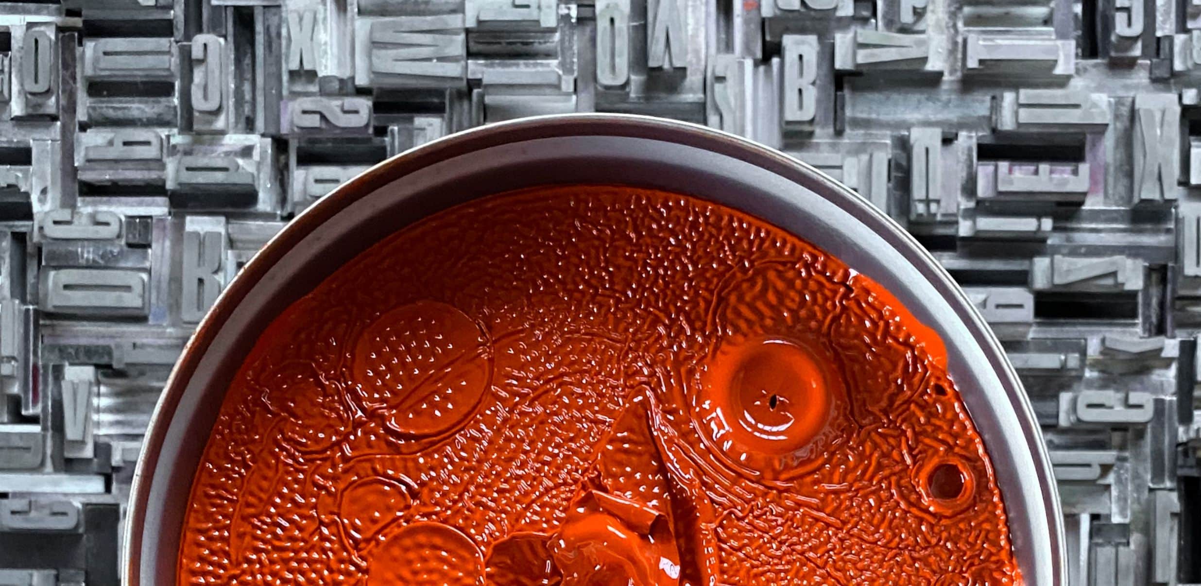
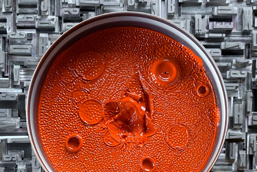
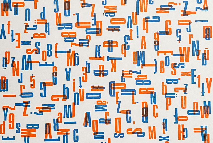
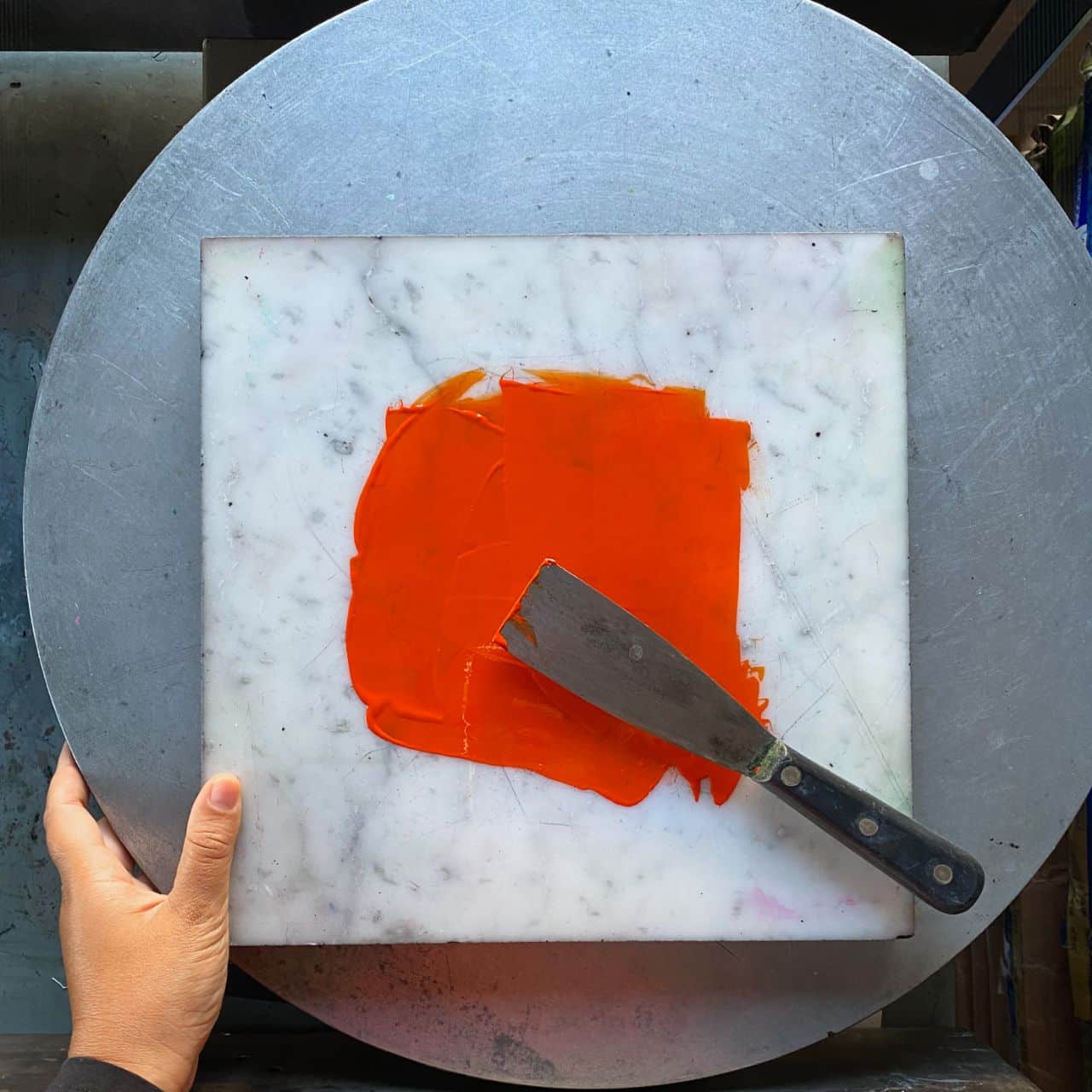
Here it is, the Metropol poster, composed and printed entirely by hand with typographic proofers. The format is 35×50 cm and was printed on Fedrigoni Arena paper.
Earlier I mentioned the specimen that Caterina from R41 sent me.
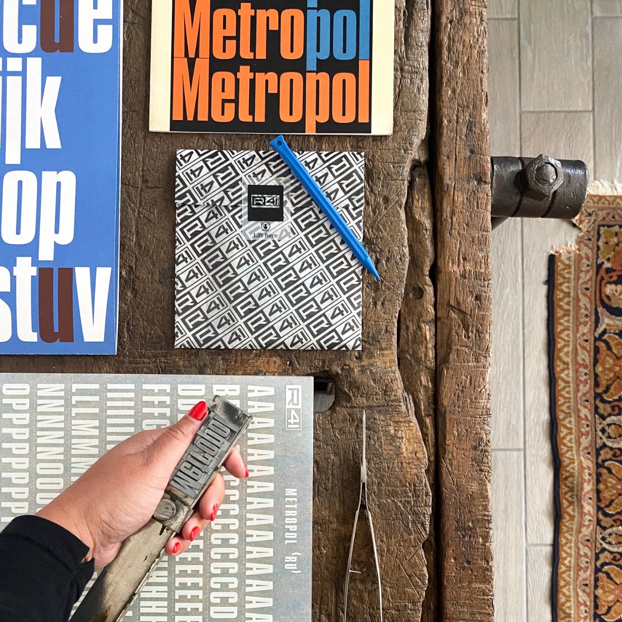
The specimen is a brochure, a paper publication that originally served to promote the release of a new typeface. Before purchasing type sheets typographers needed to understand the yield of the printed type – not just the size but also the design.
A fundamental part of the creative planning of those who have always worked with words.
As usual, this is a limited edition. There are 65 copies, inked and printed manually with typographic proofers, on handmade cotton paper from the Paper Museum in Mele (GE).
When you purchase the poster (on sale on their website) you receive it in a special pack, along with:
– The Poster
– Metropol transfers in 2 colours
– Transfer pen
– Postcard with history and description of the product
– Metropol digital font
