Have you ever found it difficult, to fully grasp the moving parts around you? I did, for a long time.
Today, however, I know we are not perfect machines and although we try to keep everything under control, there’s always something that escapes the calculation of probabilities.
One evening I came across an interview with Italian writer Paolo Giordano, in which he talked about this specific feeling: basically Science, a fundamental part of our lives, loses its value in the absence of a humanistic reference system.
Ok, so? Well, in simple terms it means that data alone cannot contain a “whole” truth. Data must necessarily be contextualized within a framework of meaning.
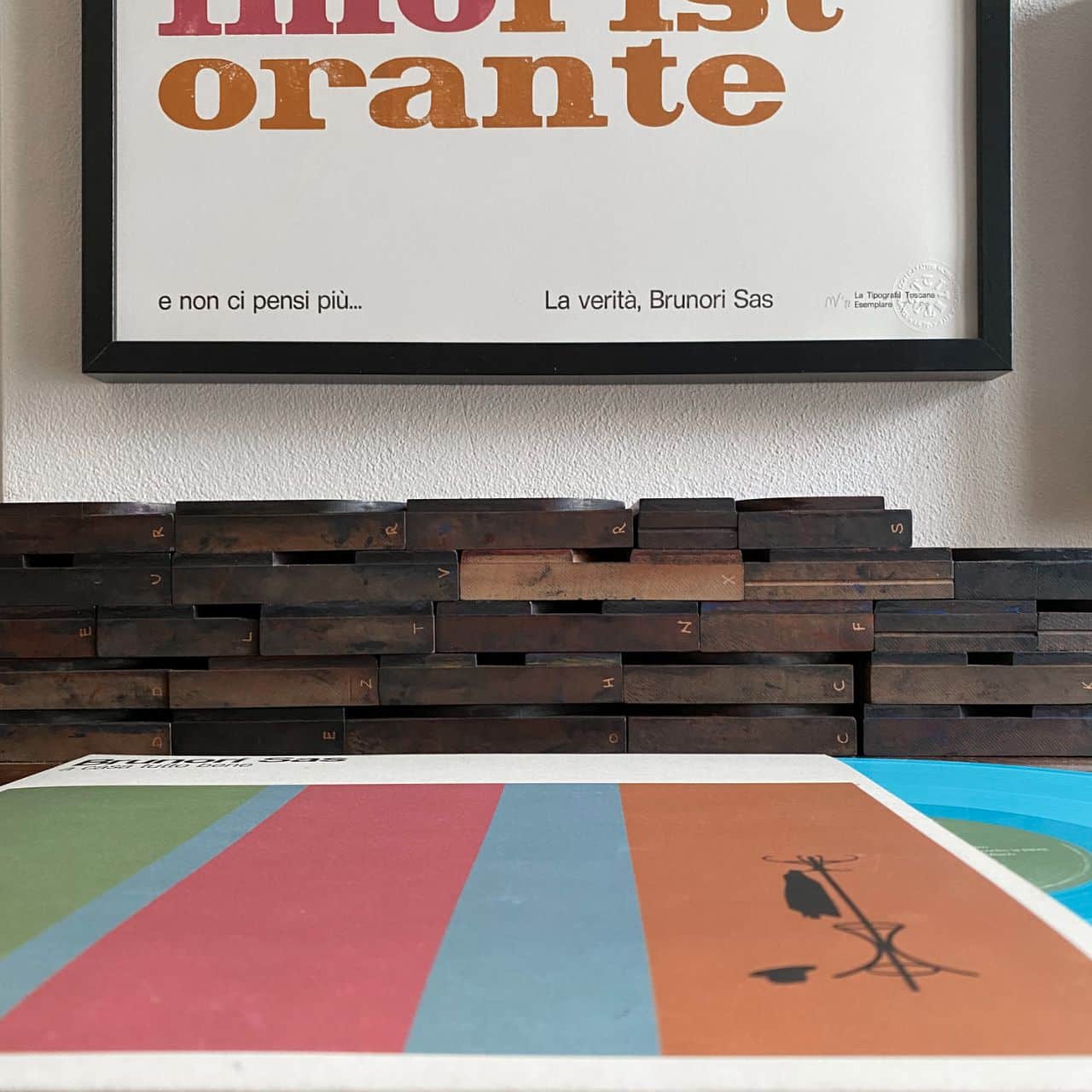
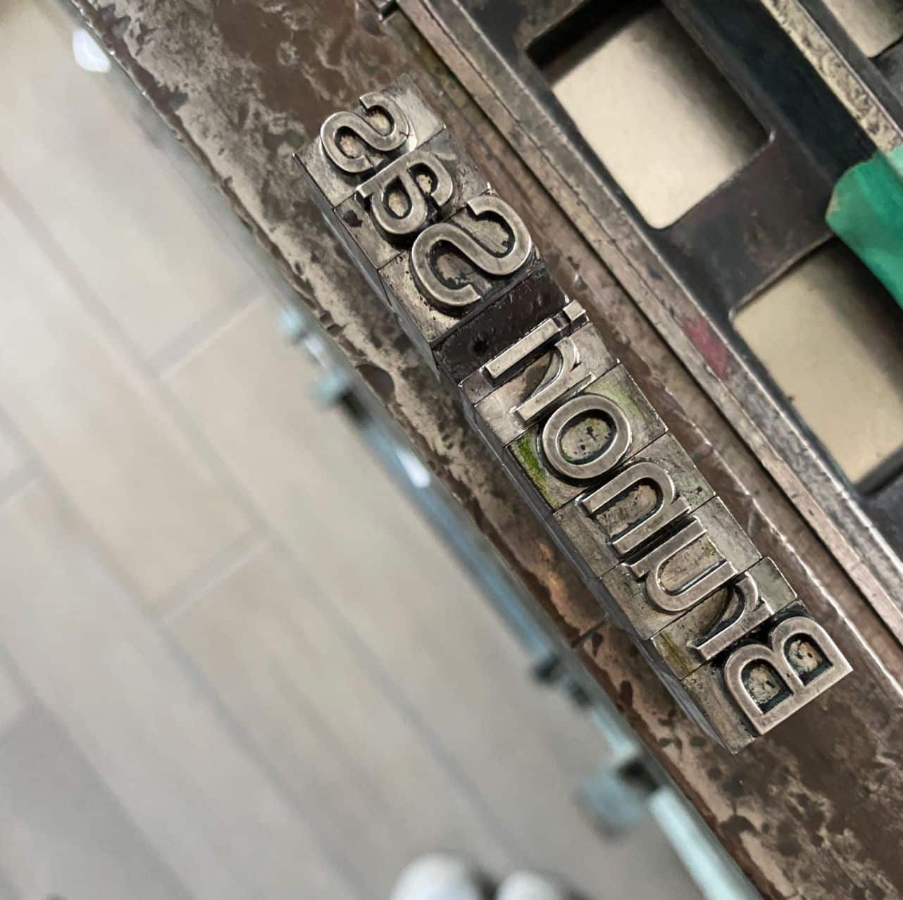
And in my head I immediately heard the humming “Did you realize that all this calculated risk also takes away the flavour of the chocolate?” It is a song by Brunori Sas called “La Verità”.
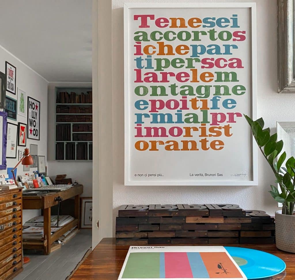
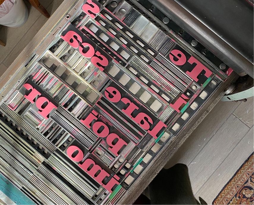
“The Truth” is the most difficult thing to grasp, much more than data. It takes more effort to decipher it. We need to “stay on things”.
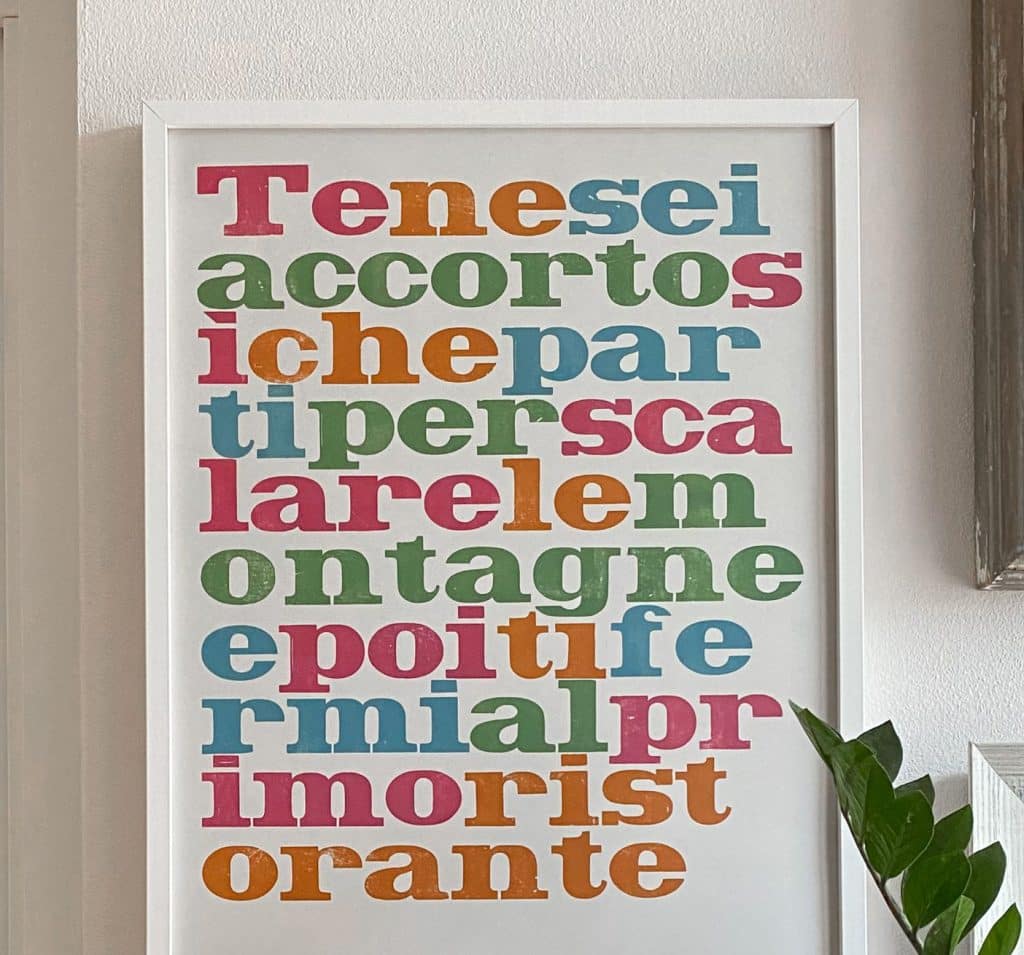
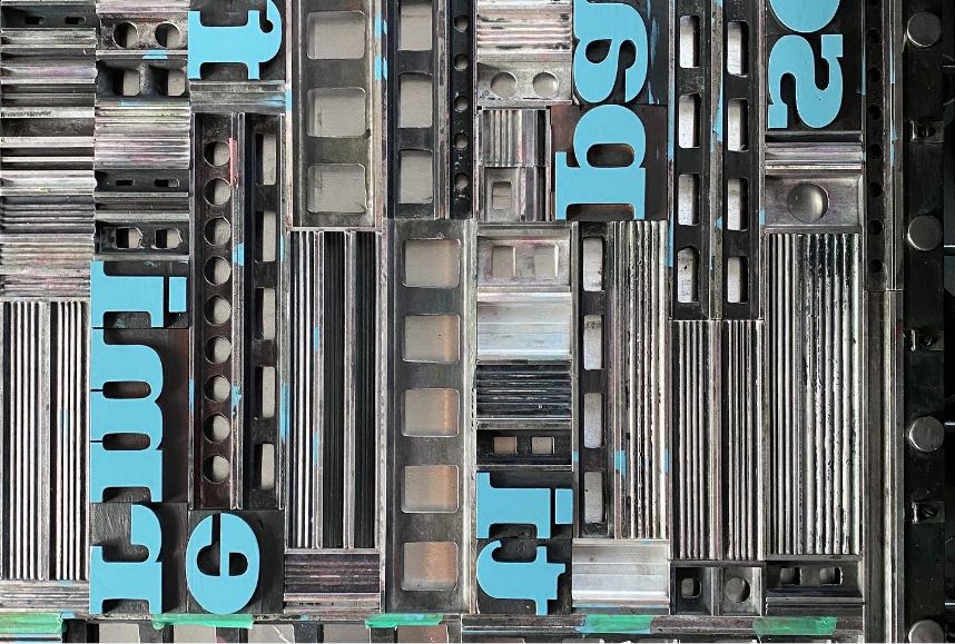
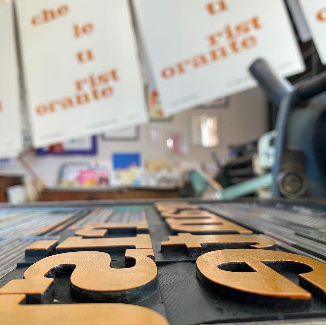
Here’s my “eureka!” moment. I decide to embark on a typographical journey: I want to turn this song into a poster. I MUST, turn this song into a poster.
I’m given green light for printing from Picicca (the record company) and from Brunori Sas himself. (did you know that to reproduce songs, lyrics, etc… you need authorization from the author? It’s called copyright and it isn’t something to underestimate, ever.) Super, off we go!
Working with songwriters is a dream come true for me.
And it is also a great honor! This is a song (and now a poster!) which is, basically, a collective narrative on the boundary between what we are and what we don’t have – the courage to be and which lays bare our fragilities and our fear of change .
“You noticed, right? That you set off to climb the mountains and then stop at the first restaurant, and never think about it again…”
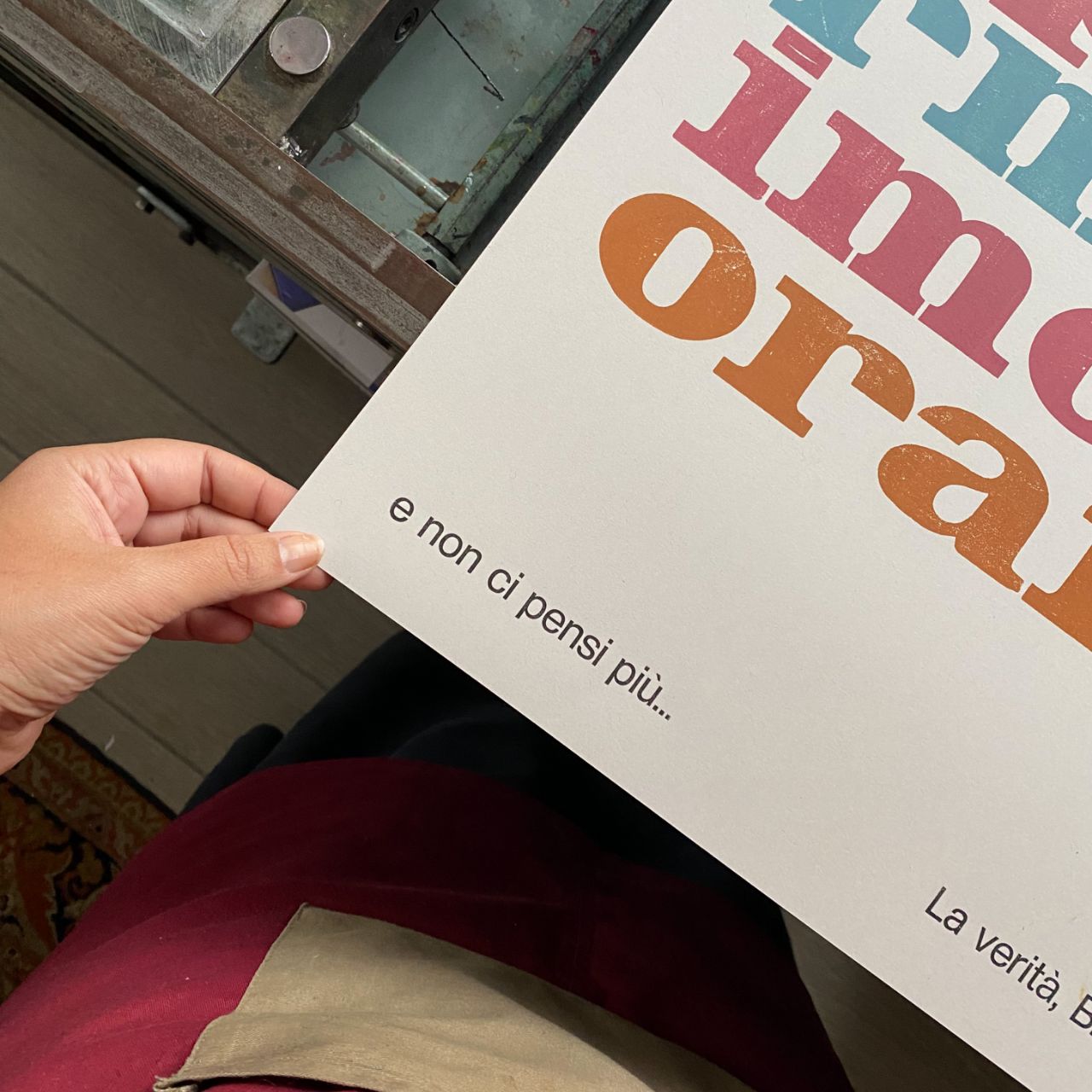
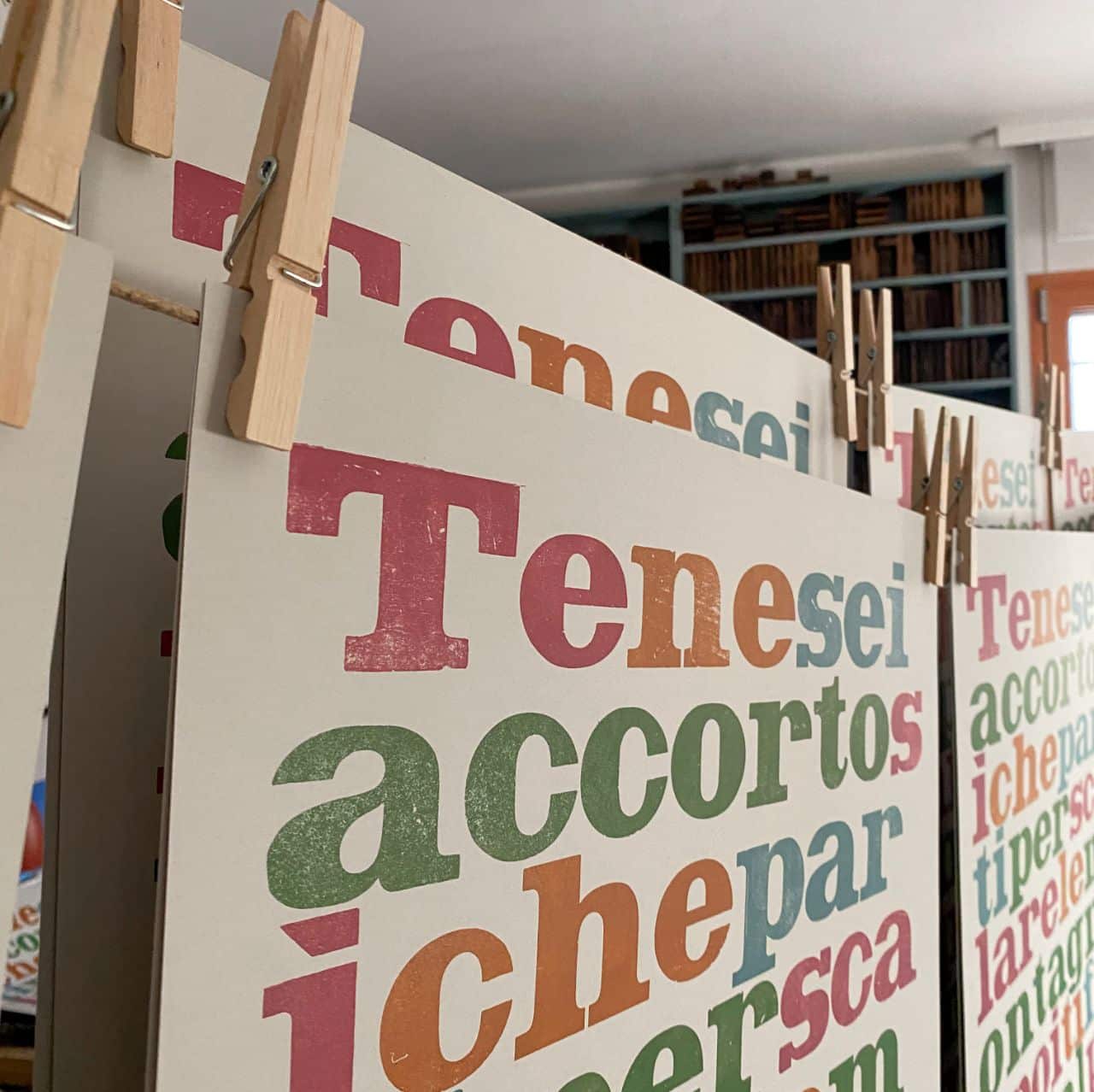
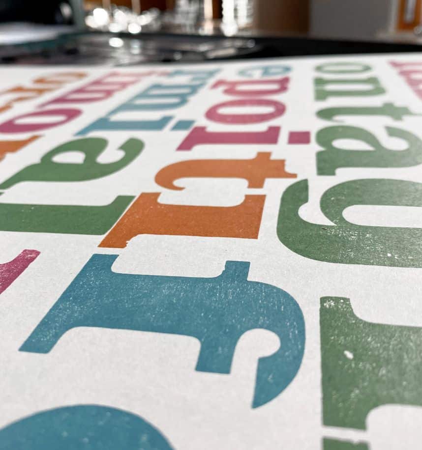
The colors of this special project are inspired by the album’s graphics (which, yes, I reproduced myself: a test of courage and dedication – I got to be honest).
The truth, however, is that I love this pink!
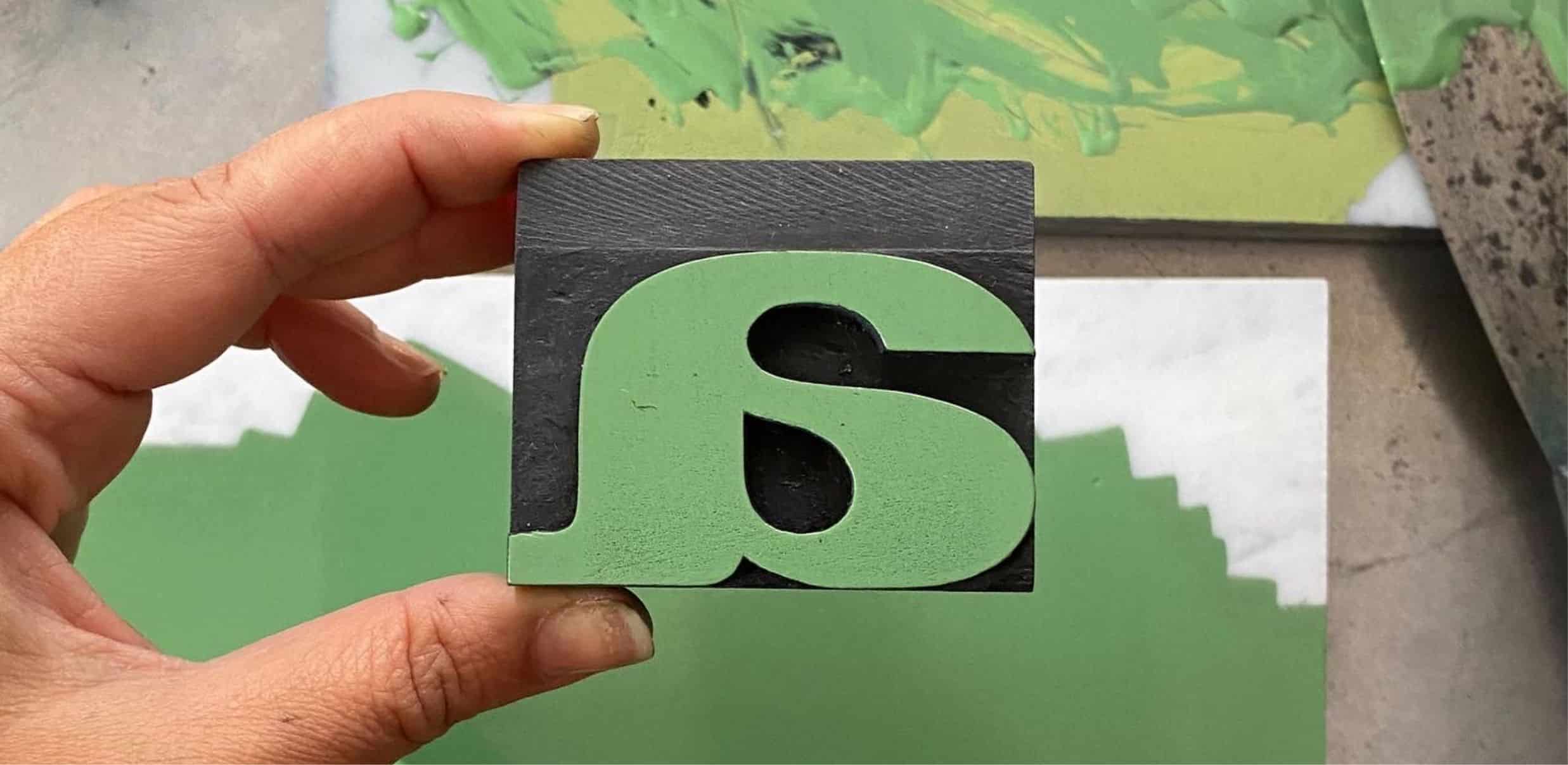
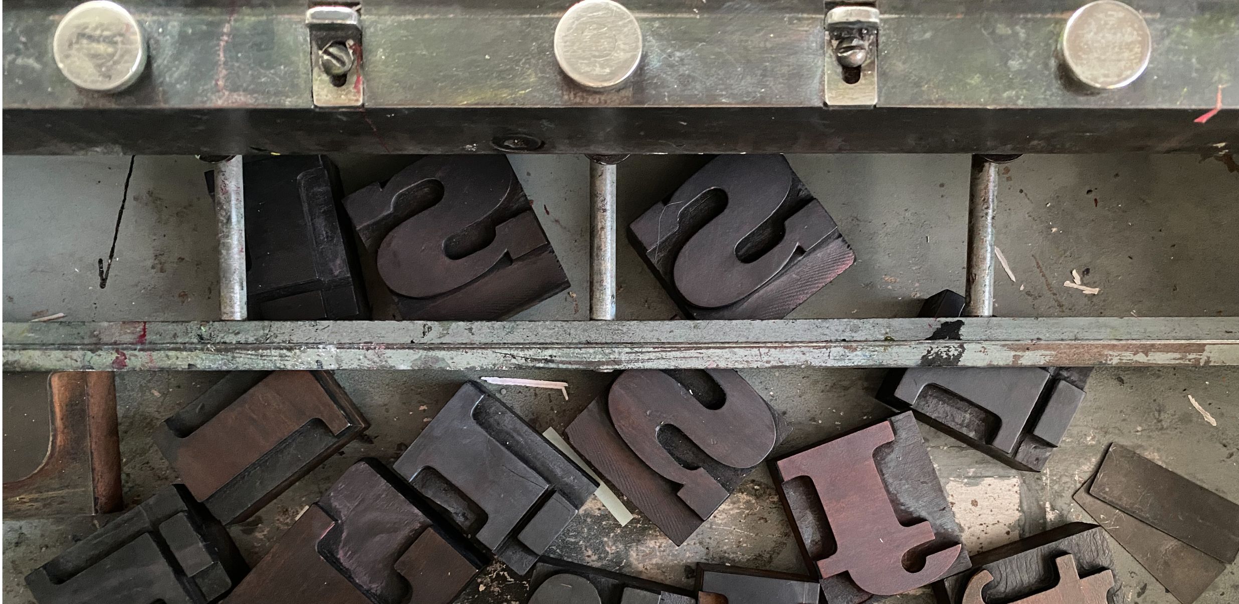
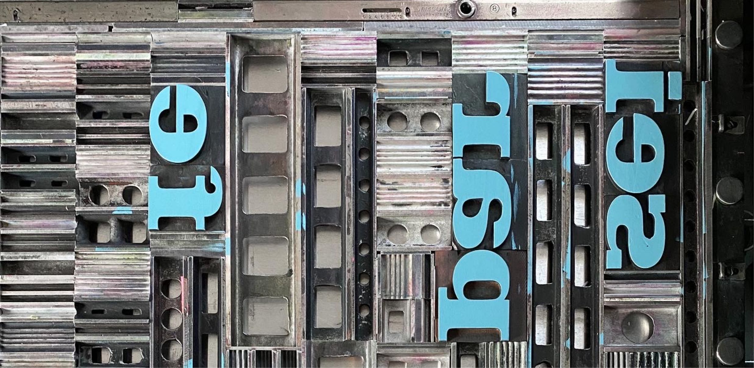
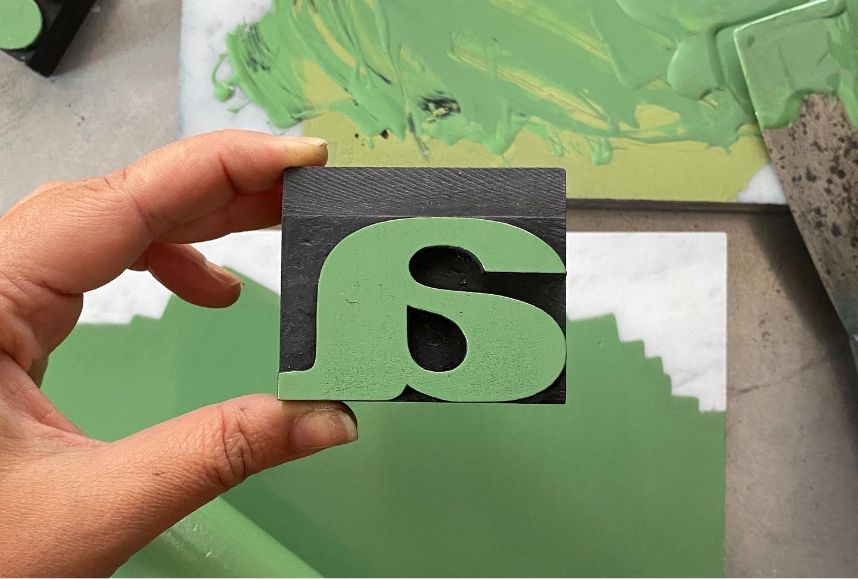
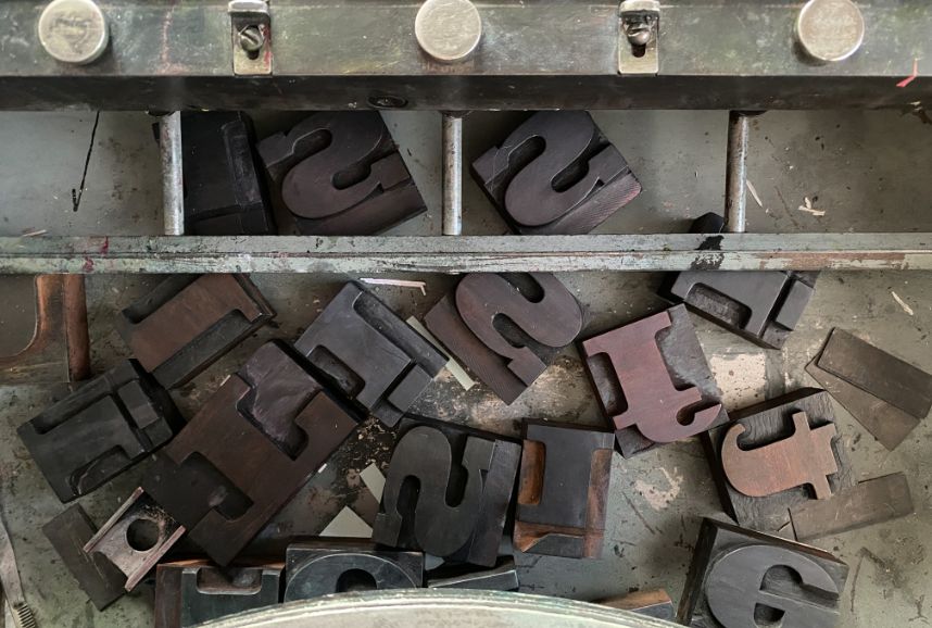
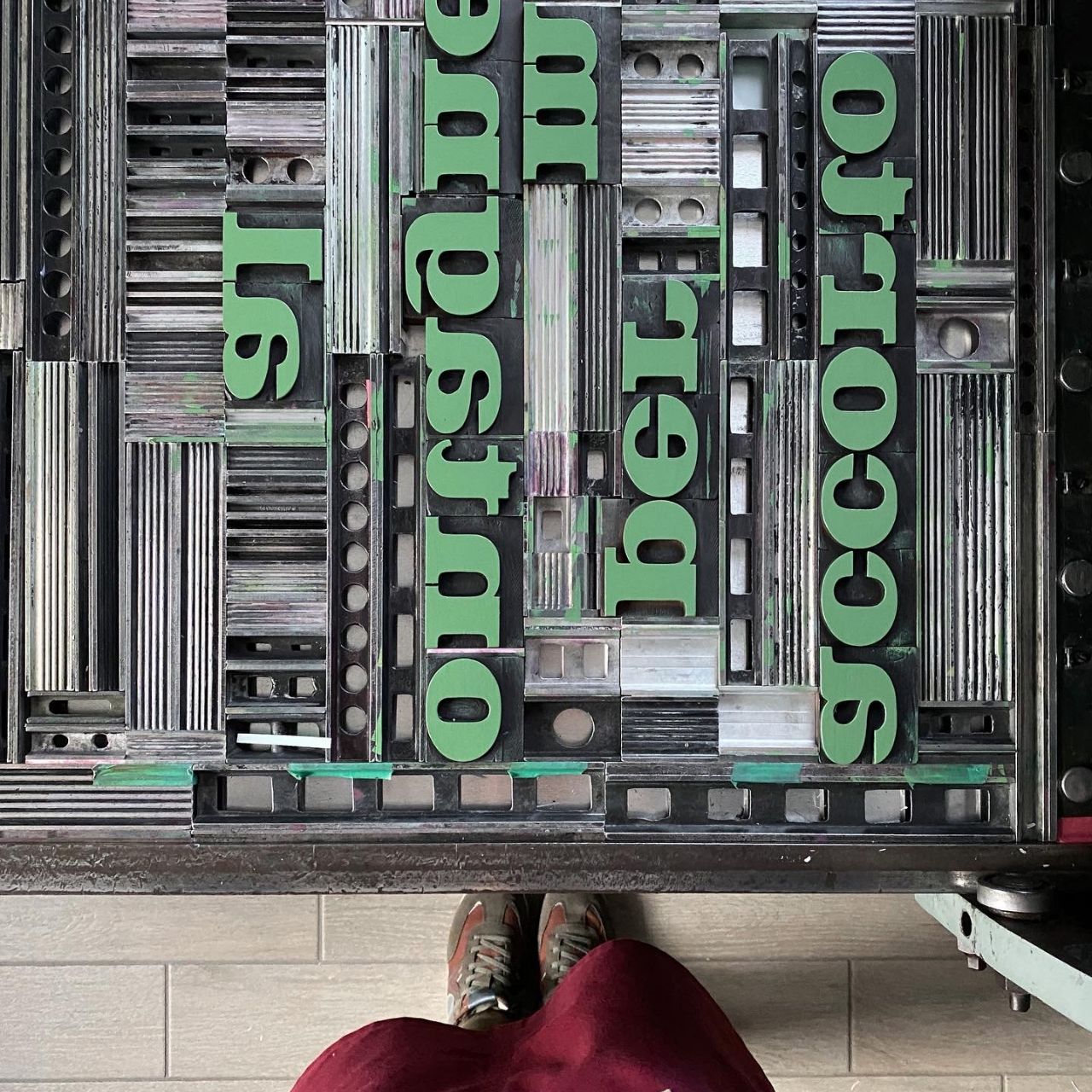
As for the font, however, I chose a splendid “Egyptian” to print this poster. All those characters that have square endings are called Egyptian. This particular design gives greater “punch” to the letters. The first example was designed by Vincent Figgins in 1815.
I have decided that “The Truth” will be read in full sound, jumping between one line and the other, focusing on every single word and every single color.
We need time to understand our nature. And to do that, we need to slow down. A concept perfectly aligned with the nature of this project.
The Rust and Black colors were the first two to come under the Press. The format, as you probably have guessed by now, is my beloved 50×70 cm.
Anyways, in short:
the format of the poster is 50×70 cm. The wooden font used is an ancient Egyptian from the early twentieth century. The paper is a splendid Favini Burano Grigio 250 gr
